Oxford Hunt Kitchen Remodel
Oxford Hunt Kitchen Remodel
This young family in the Oxford Hunt neighborhood of Charlotte, NC approached us to redesign their modest kitchen. High on their list of must-haves were improved traffic flow, separate work zones for the whole family to enjoy the space simultaneously, and professional grade appliances, including a larger 48-inch Wolf range. Aesthetically, they craved an inviting atmosphere, with rich textures, soft colors, and lots of natural light for their redesigned kitchen – tricky given the central location of the kitchen. We’d have to emphasize the natural light filtering in through adjacent spaces.
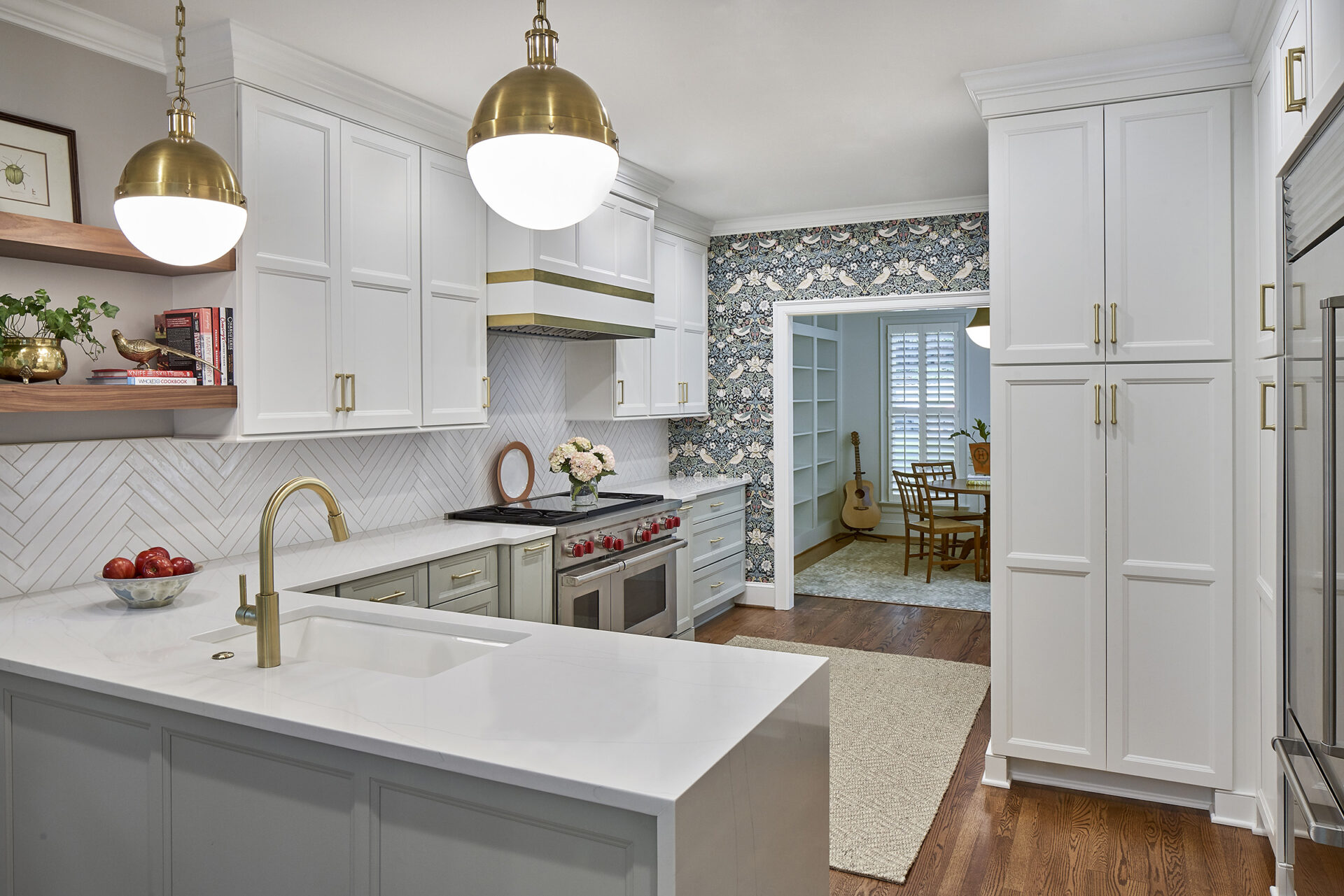
Removing the pantry closet allowed us to widen the opening between the kitchen and formal dining room, inviting more of the natural light from the front of the house to spill into the kitchen. More in keeping with present day living, this created a feeling of spaciousness and increased the connection between the two rooms.
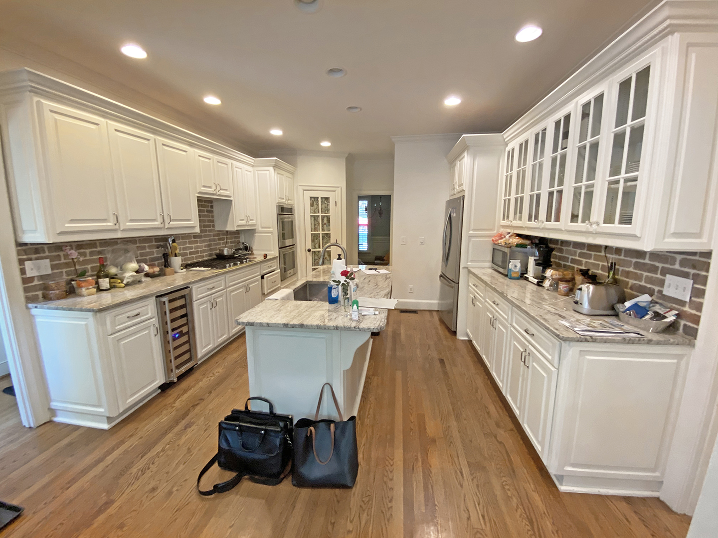
The most significant redesign of this kitchen remodel was the kitchen peninsula. While islands are all the rage, they are not the best choice for every space. This kitchen had an island that split the space in two, creating a double galley style space with an awkward traffic pattern. To open the space and free up family traffic jams, they elected to scrap the small island in favor of a kitchen peninsula instead. The sink faces the back deck, with trees from the backyard beyond, so when they’re standing at the kitchen sink in the peninsula, they now enjoy a view of nature as opposed to a wall of cabinetry.
Large pantry cabinets with roll-out and adjustable shelves, create a functional storage space within a smaller footprint, closer to the refrigerator. To keep counter clutter to a minimum, receptacles were placed inside the larger pantry cabinet to house a small microwave and toaster oven.
A coffee station was designed next to the refrigerator to speed up their morning routines. Forever in favor of multifunctional spaces, the coffee station also serves as a drop zone for mail, car keys and device charging without interfering with the work zones of the kitchen. Due to the narrow proportions of the room, shallower base cabinetry was utilized at the coffee station to keep the perpendicular kitchen peninsula as long as possible.
Reviving Classic Aesthetics
This redesigned kitchen marries several traditional elements with modernized touches to create a design that’s timeless. While the cream and soft green cabinets create a neutral, but personalized color palette, the wallpaper (which was printed successfully for the first time in 1883!) injects playful personality with a century’s long tradition. Brushed brass accents, cabinet hardware and light fixtures are another traditional material facing a renaissance, while the waterfall detail of the quartz countertop at the end of the kitchen peninsula is certainly more modern. The textured, ceramic tile backsplash, set in a classic herringbone pattern gets a refresh thanks to the 20-inch length of the tile and the application behind the coffee station.


