Plaza Midwood Master Bath
Plaza Midwood Master Bath
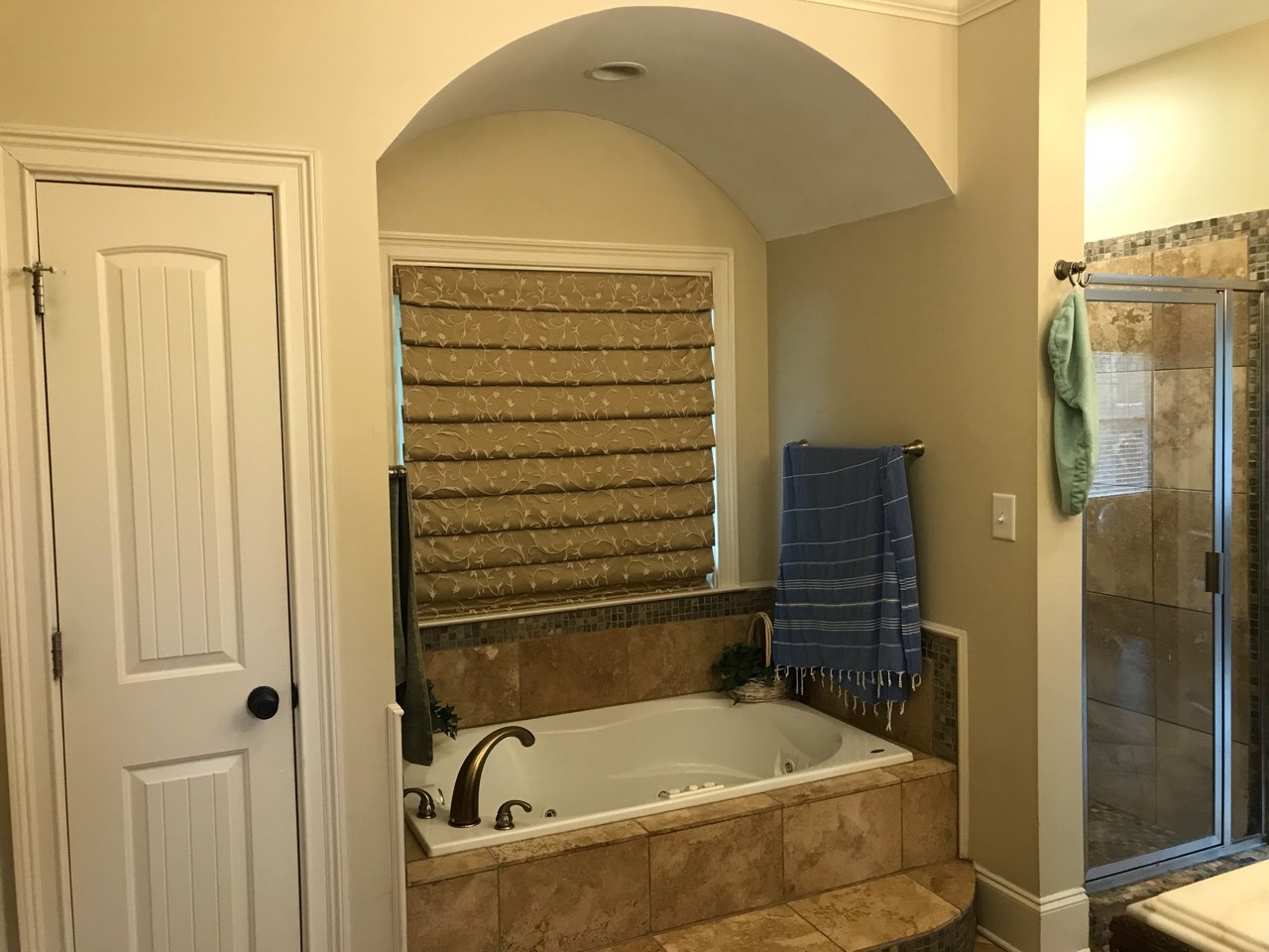
Our clients’ main objective for their master bathroom remodel was to eliminate the unsanitary jetted tub and upgrade to a larger shower. The arched ceiling detail over the bathtub, paired with the dark finishes, made the space feel heavy and cluttered while the former shower felt like a phone booth—dark and cramped.
Since the large picture window over the tub looked straight out onto the back porch, the roman shade was always closed for privacy, preventing much needed natural light from entering the space. A clerestory window was included in the redesign to allow natural light while maintaining privacy.
Spaces Included:
Location:
Project Scope:
Share:
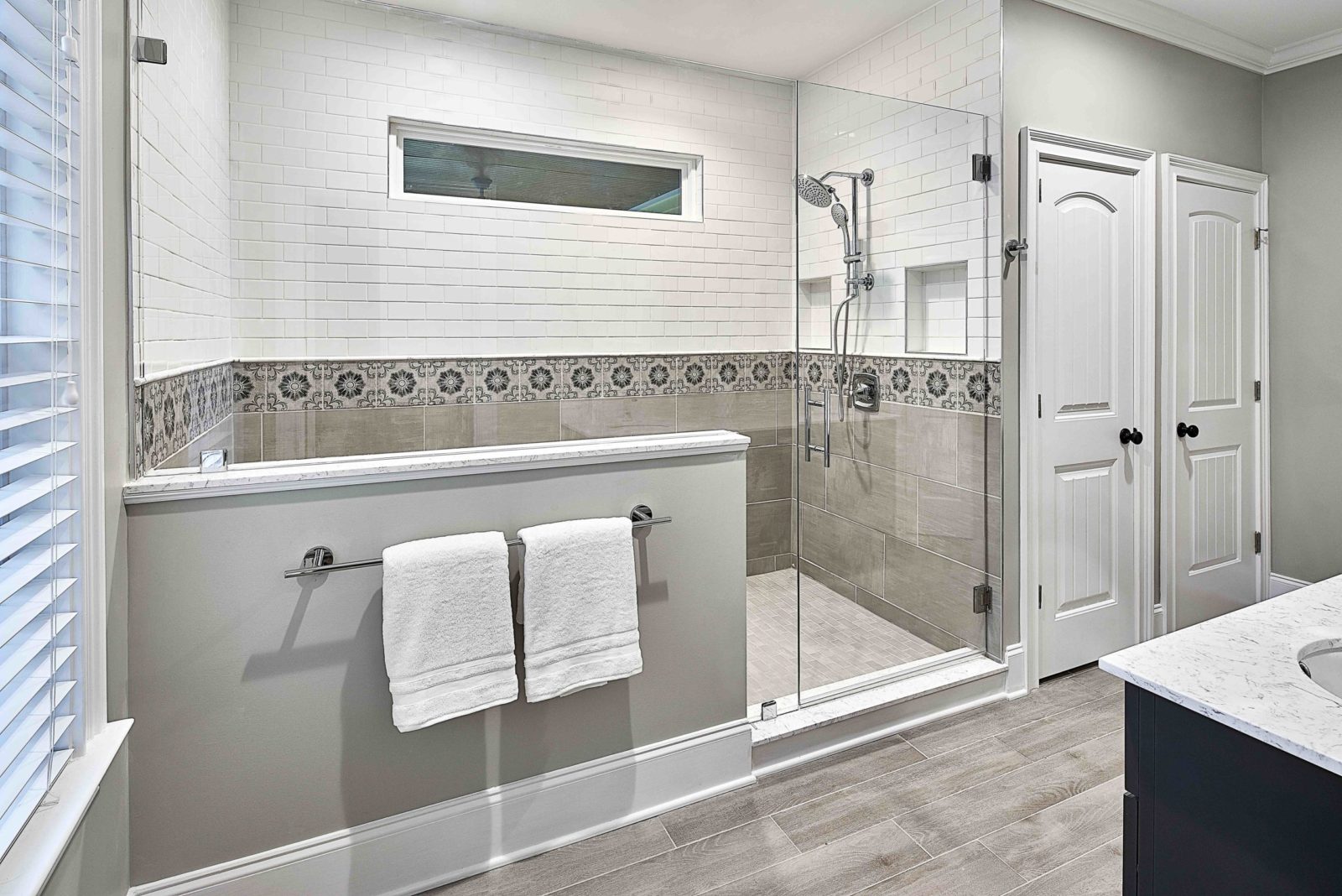
Relocating the linen closet next to the water closet allowed the window to stay centered in the long shower. The additional shower space was also helpful in incorporating some of their other master bathroom remodel must-haves: a bench seat, two hand-held showerheads, and two niches for product storage.
Vary Textures for Interest
To maximize the little natural light they had, we chose a white and gray color palette with subtle, various textures to keep the space from feeling sterile and cold. A single band of patterned shower tiles creates a transition between the white subway tile and large-format concrete-look porcelain tile below.
The faux wood porcelain floor tile planks add texture and visual warmth while the chocolate vanity adds a pop of contrast. Now, the neutral, but texturally rich space blends seamlessly with the master bedroom décor, creating a true master suite.


