Selwyn Park Kitchen Remodel
Selwyn Park Kitchen Remodel
Spaces Included:
Location:
Project Scope:
Share:
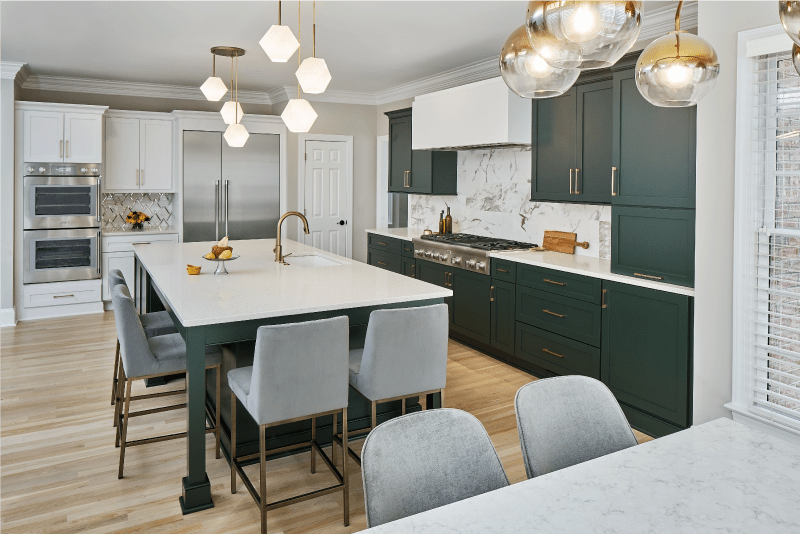
The other factor that really pushed the creativity of this kitchen remodel in Charlotte NC was their level of investment. They wanted some specific features that required customization to best meet their family’s needs, but they also had a very specific budget we needed to work within. When clients have a specific budget in mind for their kitchen remodel, it’s much easier to design for their needs. It lets us better plan ahead of time where to spend more or less based on their preferences. By being intentional about the materials specified throughout this kitchen and only splurging on the things that mattered the most to our clients (for example, the custom green cabinetry) it allowed us to trim some cost across many areas without sacrificing their most important goals or the overall aesthetic they desired.
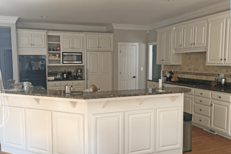
Some of the ways we were able to keep them within their budget were to keep the appliances in as close to the same locations as possible, refinish the existing floors, and mixing two different cabinet lines. Keeping the appliances in the same locations eliminated the need for extra electrical or mechanical work. The new kitchen island covered most of the footprint left by the former angled island, which minimized the amount of floor patching needed prior to refinishing the hardwoods. While unconventional, mixing two complementary cabinet lines with similar construction methods and matching door styles was a great way to ensure the customization they needed where they needed it (the island and range wall), without overspending where they didn’t (the refrigerator wall). Finishing the wall cabinets before the ceiling was another way to keep the cost in check, and due to the generous square footage of their kitchen, they didn’t need the extra storage space anyway.Proportion is the Secret
to Large Kitchens
This kitchen in Selwyn Park is much larger than it appears, but the scale of the professional appliances matches the proportions of the space, tricking your eye into thinking this is an average-sized kitchen. Both the range top and integrated refrigeration columns are 48 inches wide.
To keep cabinet costs in the budget, the wall cabinets stop short of the ceiling. This helped to create the low, horizontal aesthetic that’s repeated in the custom hood, the stacked backsplash tile, and the ten-foot-long island. By emphasizing the horizontal lines instead of the vertical lines and ceiling height, the kitchen feels even larger in person. It also prevents the cabinetry from becoming visually heavy and obtrusive, which is always a concern when using a dark color.


