Turquoise Primary Bathroom
Turquoise Primary Bathroom
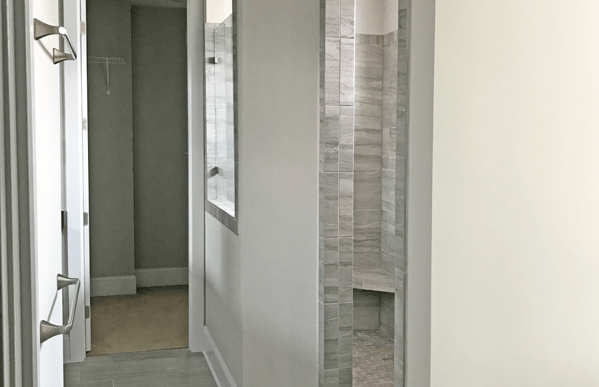
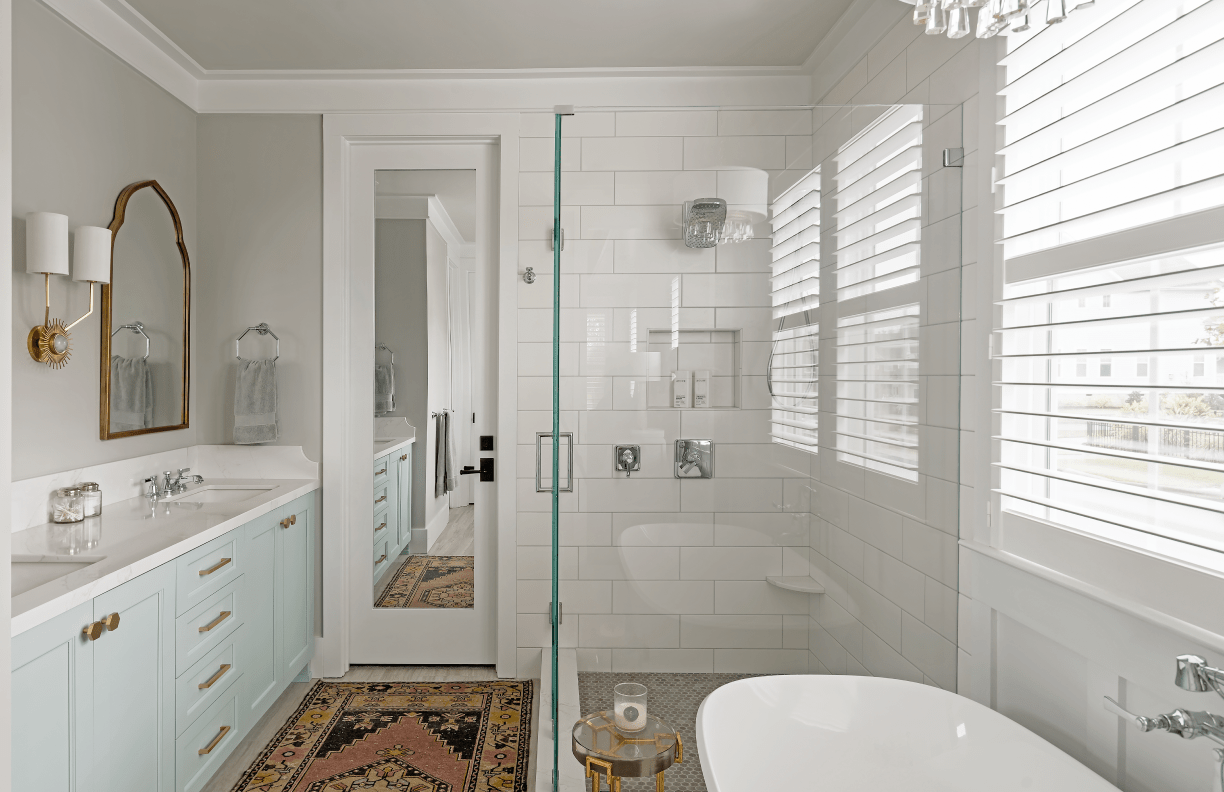
When we bought this house, we didn’t even bother moving into the master suite because we planned to remodel it right away to make it more functional. The 10′ long walk-in shower took up so much space that there wasn’t enough room for a bathtub—a must-have for long soaks. We even measured ahead of time to make sure we could fit one, otherwise, we wouldn’t have bought the house. By redesigning the configuration and placement of the windows, we were able to shrink the shower down to a comfortable size, leaving room for a 66″ free-standing tub. Even with the plantation shutters for privacy, there is plenty of natural light, which was important to maintain as part of the primary bath design.
The whole primary bath design started with the turquoise paint color for the cabinetry. Using one element to create a focal point with color keeps the space visually interesting amidst the rest of the white, gray and taupe tones of the tile. Mixing chrome with brushed brass adds another layer to the design and keeps everything from feeling too matchy-matchy.
Check out this blog post for a deeper dive into the process behind redesigning our master suite, why we chose what we did, and the challenges we overcame.
“Designing for our home is always harder than designing for a client because I love so many different things and I know what all the options are. I don’t do well in neutral spaces, so it was important to incorporate some color in a way that felt serene and relaxing instead of loud and obnoxious. I love getting ready in our new primary bathroom!”
– Chelsea Allard, Designer & Homeowner
“It was really enlightening to go through a major home remodel with our own team. Even though we do this every day, it was helpful to experience it from the perspective of the homeowner. It gave us even more empathy for our clients because we understand what it’s like to live through the inconvenience and the mess firsthand.”
– Brad Little, General Contractor & Homeowner


