Let's Socialize

Design Studio + Billing & Deliveries: 2923 South Tryon St.
Suite 280
Charlotte, NC 28217
*By Appointment Only
Billing & Deliveries: 3421-M St. Vardell Lane Charlotte, NC 28217

(704) 759-3920

hello@revisioncharlotte.com

Follow Us

May 1, 2023 by Chelsea Allard

How to Choose: Inset vs Overlay Cabinets

When it comes to budgeting your kitchen remodel, labor will always be the largest expense. But when it comes to material selections: cabinetry, countertops, appliances, and flooring are also big-ticket items that will have a significant influence on the level of investment. Depending on your end goals, you may choose to save or splurge on any of these material items, but generally speaking, expect cabinetry to make up anywhere from 30-50% of your overall kitchen budget. Since cabinets are such an investment, it’s important to know what you’re getting.

Your kitchen designer will walk you through various cabinet lines and features to help you decide whether inset vs overlay cabinets are right for you. But, from a high level, here are some things to look for when choosing your kitchen cabinets.

What Are Inset Cabinets?

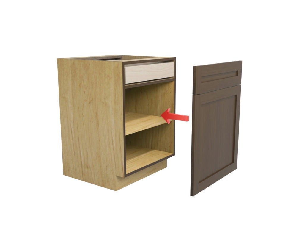
So, what exactly are inset cabinets? Inset cabinets are characterized by the cabinet doors sitting flush within the frame, rather than overlaying it. This design gives a smooth and seamless appearance, reminiscent of classic craftsmanship. Given their intricate construction, inset vs overlay cabinet may command a higher price point.

Your kitchen designer will be pivotal in showcasing the unique attributes of inset cabinets and how they align with your desired aesthetic. To ensure your investment is well-placed, it’s crucial to familiarize yourself with the details.

What Are Overlay Cabinets?

Diving deeper into kitchen cabinetry, let’s explore overlay cabinets. When you compare inset vs overlay cabinets, what sets them apart?

Overlay cabinets are aptly named for their design where the cabinet doors ‘overlay’ or cover the cabinet frame, either fully or partially. This creates a continuous face, offering a more contemporary and sleek appearance. The amount the door overlays the frame can vary, leading to designations like “full overlay” or “partial overlay.” Given their versatility and more straightforward construction, overlay cabinets often come with a broader range of price points to suit different budgets.

Cabinet Box Construction: Inset vs Overlay Cabinets and More

While until this point we’ve been looking at inset vs. overlay cabinets, we should take a moment to zoom out and look at the three possible ways your cabinets are always constructed. Whether they’re completely custom, stock, made on-site, or pre-built, kitchen cabinets are always either frameless, framed, or inset. Frameless cabinets are the standard for everywhere in the world except the United States. While they are increasingly popular here as well due to their accessibility, they’re not the only option.

#1: Frameless Cabinets

Frameless cabinets consist of a box without a face frame that sits on the front of the cabinet. The doors attach directly to the cabinet box instead of the frame, so the openings are typically 1 ½” wider. Because there isn’t a frame, reveals between adjacent doors and drawer fronts are tighter, creating a cleaner look.

kitchen-cabinets

Frameless cabinets offer slightly more storage space as the doors attach directly to the cabinet box.

Frameless cabinets are the standard for contemporary styled cabinets (think high-gloss or textured laminates) but it’s a common misconception that all frameless cabinets are contemporary. It’s just as simple to use this construction method and pair it with a traditional door style so you can enjoy the benefits of accessibility without sacrificing the traditional look.

The main benefit to frameless cabinets is the additional storage space. As we mentioned above, because there isn’t a frame, the amount of usable drawer space inside each drawer will be about 1″ wider than a framed cabinet of the same size. 1” of extra drawer space may not sound like a lot, but when you consider you may have a dozen drawers in your kitchen, that adds up to extra cubic footage that otherwise would have gone to waste. Something to not about inset vs overlay cabinets? Neither are frameless.

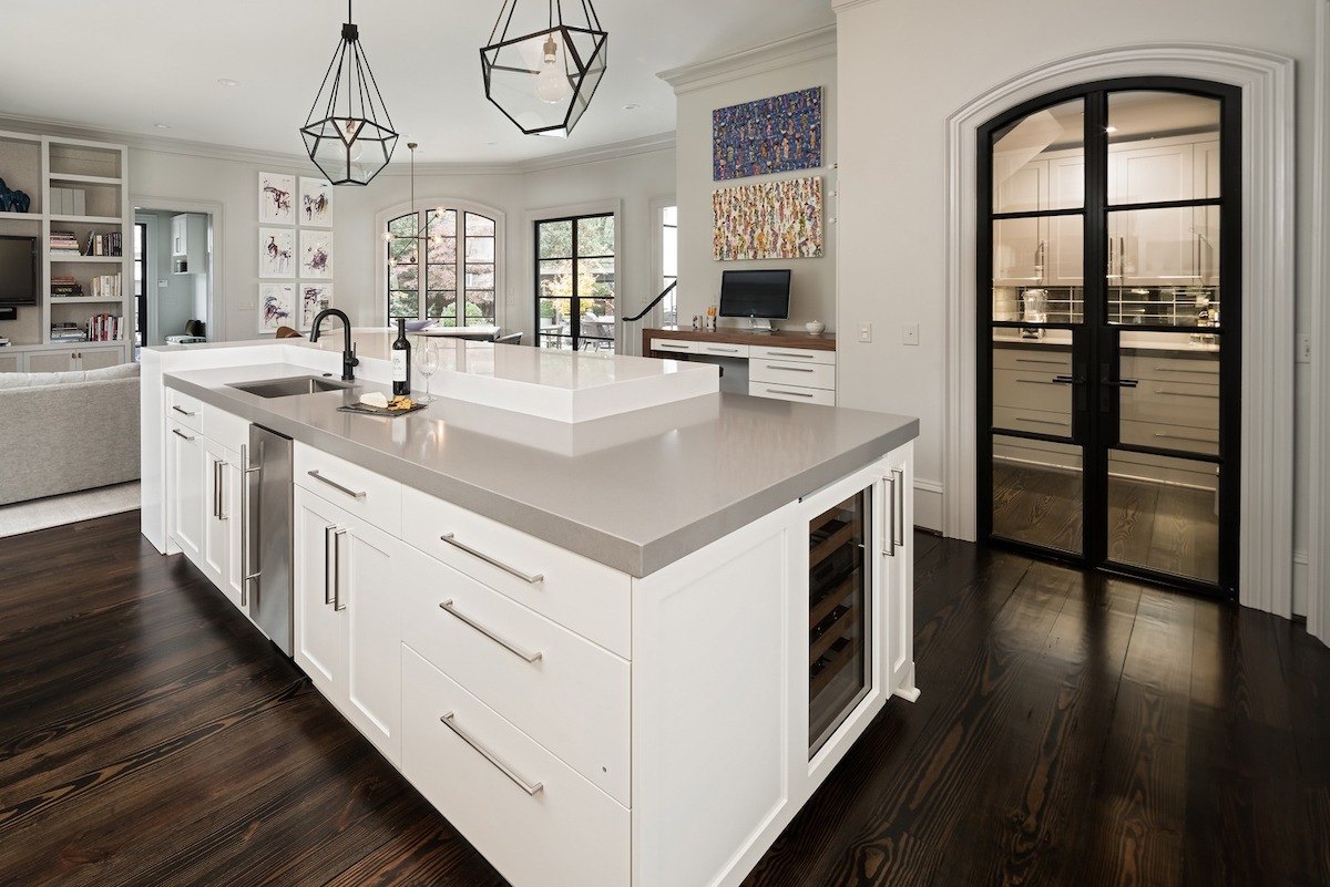
inset vs overlay cabinets

Frameless cabinets with a 3″ thick gray quartz counter create a transitional look in this Charlotte, NC kitchen remodel.

Pros of Frameless Cabinets:

  • More storage space, particularly in drawers
  • Contemporary and traditional or transitional styling is available
  • Tight reveals for a clean look
  • Can be used with metal drawer boxes

Cons of Frameless Cabinets:

  • When using veneers like textured melamine, cabinet heights may be limited due to size restrictions of the veneer (creative kitchen designers can often design a workaround)

#2 Face Frame Cabinets (or simply “framed”)

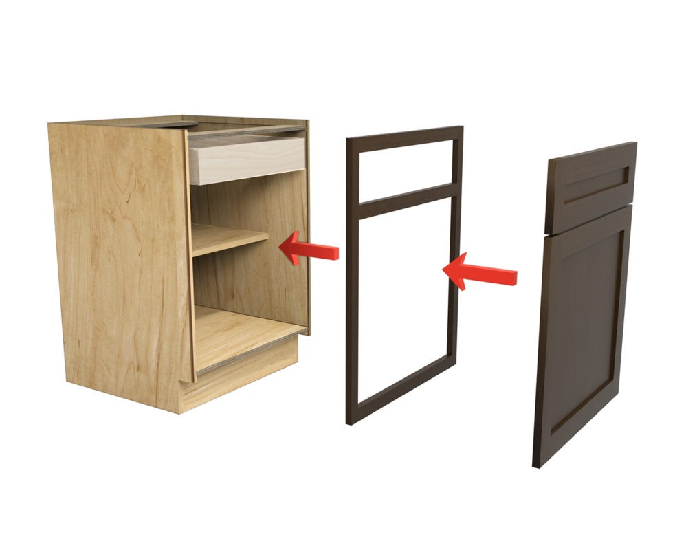
Framed cabinets are slowly shrinking in popularity due to the availability and accessibility of frameless cabinets, as discussed above. A framed cabinet is built with a ¾” thick piece of wood (typically 1 ¼” – 1 ½” wide) that attaches to the front of the cabinet box and covers the opening. This is what the door hinges will attach to. The sides of the box are not flush like they are in frameless cabinets, so the inside storage is slightly narrower, as is the interior space of drawers.

Framed cabinets come in various overlays, meaning the reveal between doors and drawers will vary. Half or semi-overlay cabinets will have much larger gaps so they tend to be less expensive and often look dated. Full overlay cabinets have much tighter gaps and don’t always have center stiles between doors, creating a more accessible cabinet and a cleaner look.

Pros of framed:

  • Readily available
  • Larger reveals make it easier to cheat fillers when walls aren’t perfectly plumb or square

Cons of framed:

  • Slightly less accessible storage
  • Can look dated if using semi or half-overlay reveals
  • Contemporary veneers are typically not available

#3 Inset Cabinets

While inset cabinets are technically framed, the difference is that instead of the door and drawer fronts resting on top of the face frame, they sit inside it, resulting in a flush look. While comparing inset vs overlay cabinets, it’s important to note that inset cabinets are the most popular style of framed cabinets since they offer a very distinct look that mimics handmade, site-built furniture. If you’ve searched for kitchen inspiration on Pinterest, you’ve seen inset cabinets.

Because of the extra reveal required for drawer and door operation, inset vs overlay cabinets offer the least amount of storage space when compared to full overlay face frame or frameless cabinets. Obtaining perfect reveals is trickier from a manufacturing perspective, so expect inset cabinets to cost up to 15-20% more than full overlay face framed cabinets. Since the frames – and therefore seams – between pre-built cabinets are visible, we recommend combining cabinet boxes using custom cabinet capabilities to eliminate as many seams as possible. Not all cabinet lines will allow this, so keep that in mind if that’s the look you’re after.

inset cabinets

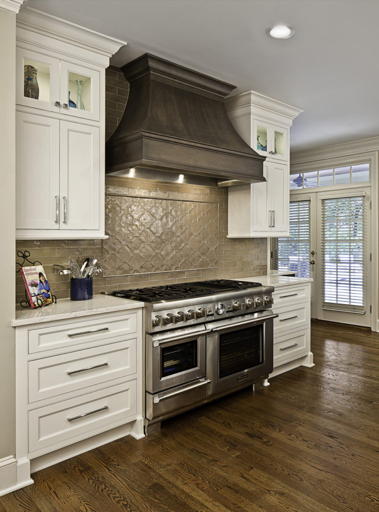
Cream painted inset cabinets with a beaded face frame create a traditional, classic look in this south Charlotte kitchen remodel

Pros of inset cabinets:

  • Inset Cabinets give off a Transitional to a traditional, high-end look

Cons of inset cabinets:

  • More expensive
  • Slightly less storage space (only select if wall cabinets can be made 13” deep or else larger dinner plates may not fit in them)
  • Inset cabinets will need constant adjusting to maintain reveals

General Box Construction

As dealers for several American-made cabinet lines, we prefer North American plywood boxes with no added formaldehyde – simply put, they’re safer and less toxic than Chinese plywood. Plywood boxes are more stable and of higher quality than particleboard boxes.

Framed cabinets are typically built with plywood boxes, while frameless cabinets are often available in particleboard or plywood. While there are industry standards as far as construction materials and details, each cabinet company will have subtle differences that your kitchen designer will be able to explain. Personally, we’re huge proponents of plywood boxes and don’t recommend particle board unless you’re trying to go super cost-effective in a secondary space like a laundry room.

Cabinet Drawers

Of the lines that we represent and supply, most of the drawer boxes are either 5/8” or ¾” solid hardwood or ¾” plywood. While plywood drawer boxes can be more stable than hardwood, people often prefer the more polished look of hardwood drawers. In either case, they feature dovetail joints and soft closing guides as standard features. Your designer can talk you through how to choose inset vs overlay cabinets from a particular cabinet line if you’d prefer one specific look over the other.

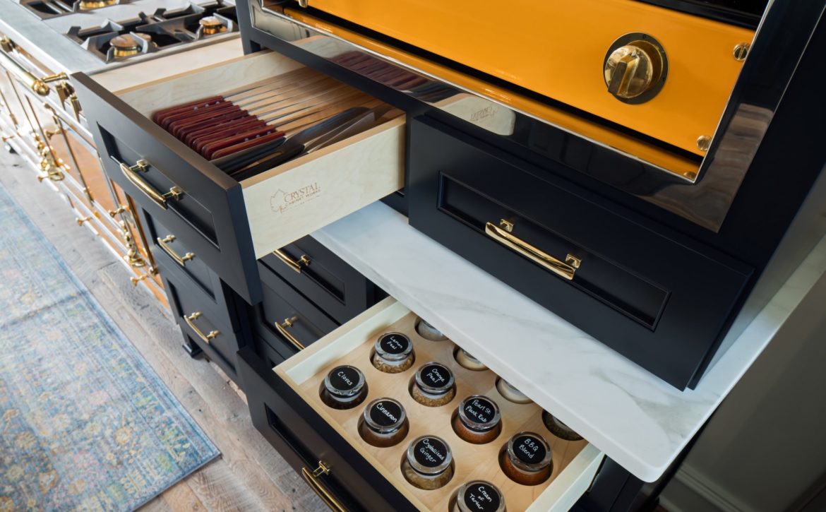
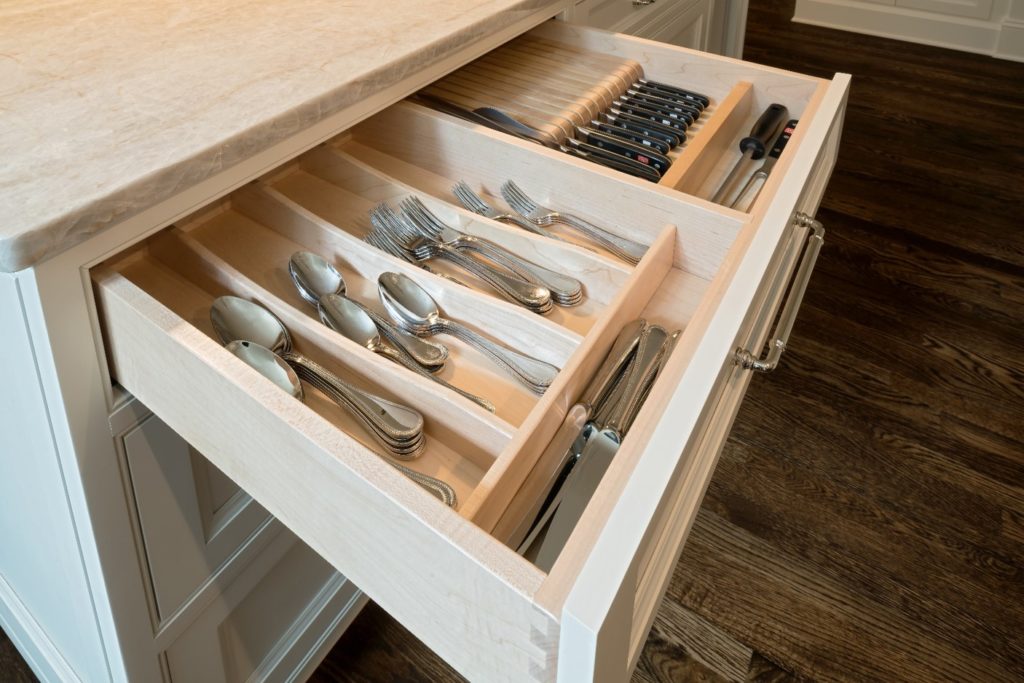
Hardwood cabinet drawers with dovetail construction and flatware storage

⅝” hardwood drawers with dovetail joinery and soft-closing guides are standard options for this cabinet line. Matching drawer organizers keep flatware and knives neat and tidy.

Cabinet Pricing

Just like countertops, every cabinet line is priced differently and will vary significantly depending on quality and manufacturer. Quality construction, availability of customizations, and the number of finishes and styles available will all affect the pricing. Because there are literally millions of combinations available when choosing kitchen cabinets (inset vs overlay cabinets, etc.), the general pricing formula for made-to-order cabinets is as follows:

Standard cabinet box price

% Upcharge for box material

% Upcharge for overlay selection

Price of door & drawer style selected

Upcharge for drawer box and guide selection (as applicable)

% Upcharge for finish and wood species

Upcharge for any custom modifications (as applicable)

+                  freight and tax

= cabinet price

Not all lines charge for all of these items and they certainly don’t charge the same amounts, so it can be difficult to compare apples to apples when considering how to choose kitchen cabinets from two different lines. We’ve found that depending on the aesthetic and functional goals of the client, and the complexity of the design, certain lines are more appropriate than others. Because there are so many optionsinset vs overlay cabinets for one We’re happy to discuss the differences so you can be sure you’re selecting the line that’s best for your needs.

Ready to discuss your dream kitchen, your dream inset cabinets, or anything else home-related with ReVision? Schedule a call with one of our Project Developers!

May 20, 2021 by Chelsea Allard

7 Kitchen Cabinet Organization Ideas for Your Remodel

Cabinetry is one of the biggest investments you’ll make when remodeling your kitchen. We’ve gathered our best kitchen cabinet organization ideas to help you consider which features you’ll want to discuss with your kitchen designer.

May 20, 2021 by Chelsea Allard

5 Kitchen Drawer Organization Tips

Here are five of our favorite kitchen drawer organization tips to prevent “junk drawer plague” – where every drawer becomes a mess – no one has time for that nonsense.

September 30, 2020 by Chelsea Allard

What’s the Best Kitchen Design for a Growing Family?

A great kitchen design isn’t just about the traditional work triangle. Particularly for a growing family, kitchen design should also be inclusive of the myriad ways your kitchen will be used –for which activities, when and by whom. The traffic flow in, out and through a family-friendly kitchen should be a critical factor in space planning, not just during meal times, but throughout the entire day. This young family tasked us with the challenge of opening up the previously remodeled kitchen of their 1950’s Myers Park home, after hearing from other contractors that what they wanted to accomplish couldn’t be done.

Kitchen Design Goals

While not the original kitchen to the home, the remodel by the previous owners had addressed aesthetic concerns, but not the space planning. With two young children at home, our clients’ most important goal for the remodel was an open kitchen design for increased visibility and traffic flow. Their secondary goals included maintaining a formal dining room and foyer to stay in keeping with the age and style of the home; transitional style with modern amenities such as professional-grade appliances; more functional storage and additional pantry space; a large island with seating for four and to repair the faulty hardwood floors from the previous renovation.

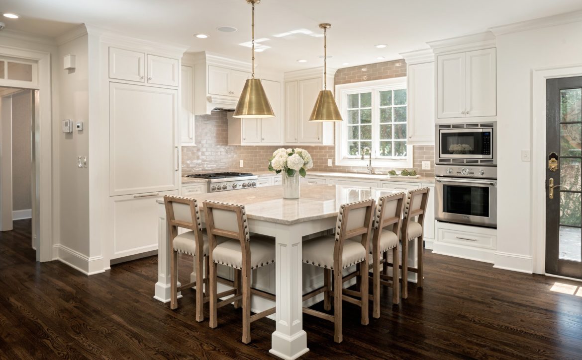
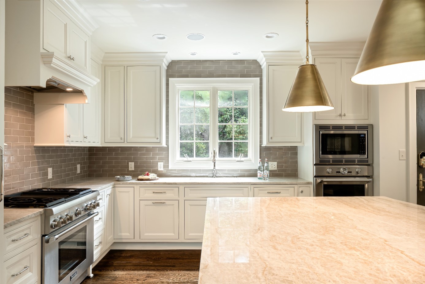
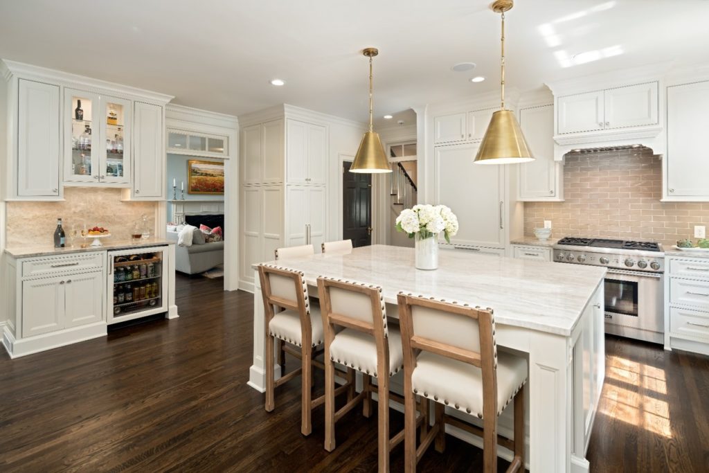
Cream kitchen with brass pendants over the island and a large window over the sink

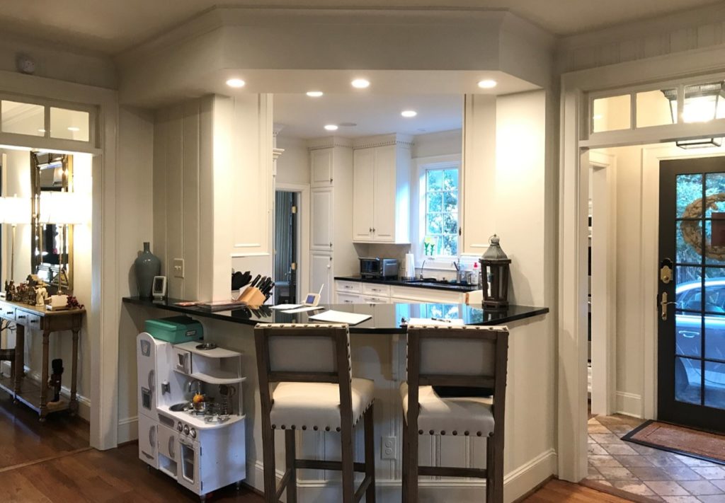
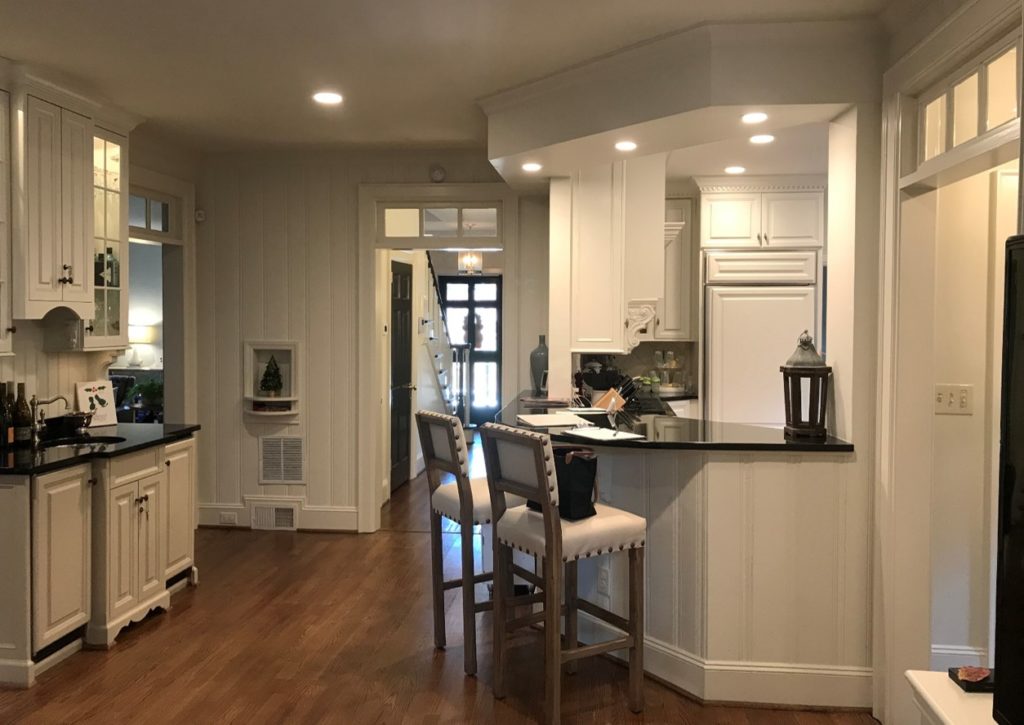
The angled walls with bar height pass through helped the kitchen to feel somewhat connected to the den, but it was still impossible for our clients to keep an eye on their kids while preparing meals. The tiny vestibule at the back door was tight and included two-floor transitions since the tile and den floor was higher than the kitchen and foyer, creating a tripping hazard. The light from the kitchen window couldn’t filter into the hallway or living space, creating a dark atmosphere. The plan was to remove the walls between the den and kitchen to open the space, but the challenge was ensuring enough wall space for cabinetry and appliances without sacrificing valuable storage.

A Family-Friendly Kitchen Design that Works

Ultimately, after reviewing three different kitchen designs, our clients elected to close the doorway between the formal dining room and the kitchen. This allowed the kitchen to take on a functional L-shape and kept all the major appliances out of the island, increasing usable counter space. Because the formal dining room was right next to the kitchen, losing the extra doorway didn’t impede traffic. Opening the backdoor to the kitchen made it easier to haul toddlers and groceries to and from the car.

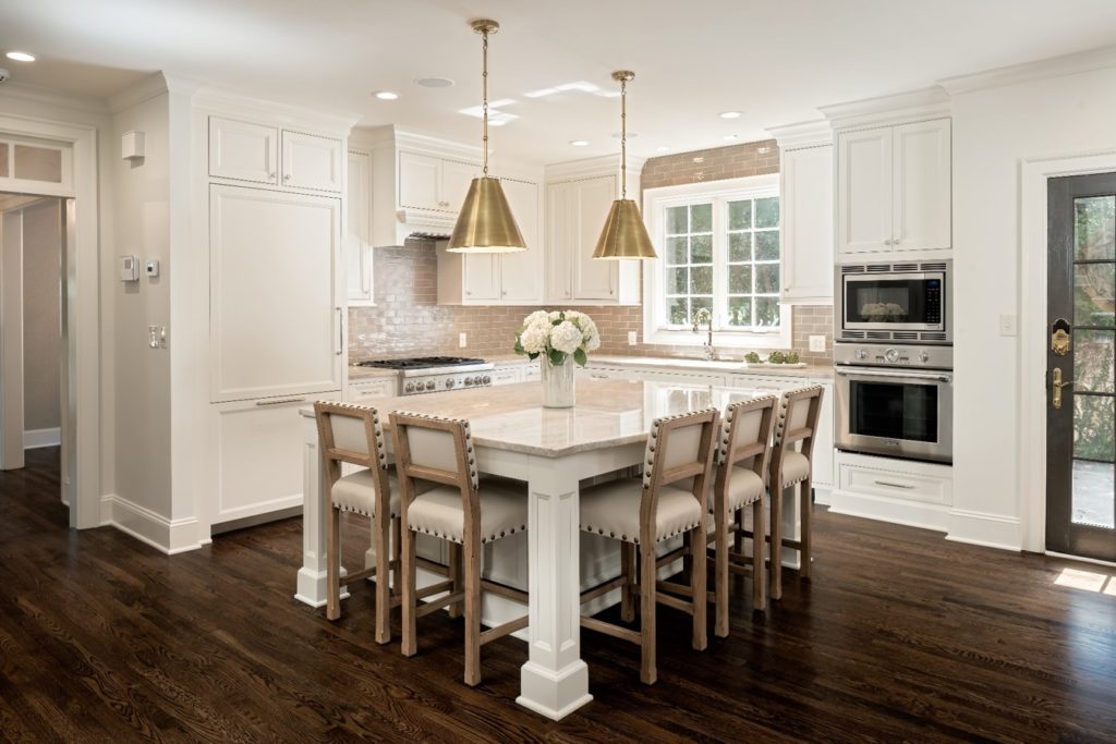
The new kitchen design features an open plan from the den and kitchen, making it easier to drift between the two spaces seamlessly. Reframing a portion of the existing floor system to bring the whole area down to the same level eliminated tripping hazards and made floor clean-up a breeze. We left the original window in the same location, but with the removal of the walls, light pours deeper into space, making it feel more spacious. Ultimately, there was extra space to fit an even larger island than what was in the original kitchen design, providing ample seating for the whole family.

kitchen-design-ideas

BEFORE – The awkward, angled counter with dropped soffit kept the kitchen and den separate, preventing an easy flow for daily childcare or entertaining. The barstools blocked traffic to and from the back door—the main point of entry for this family.

kitchen-design-ideas

AFTER – Working extra storage into this kitchen design was simple thanks to the large island. Hidden base cabinets under the seating area provide adjustable shelving for less frequently used items.

Maximizing Space

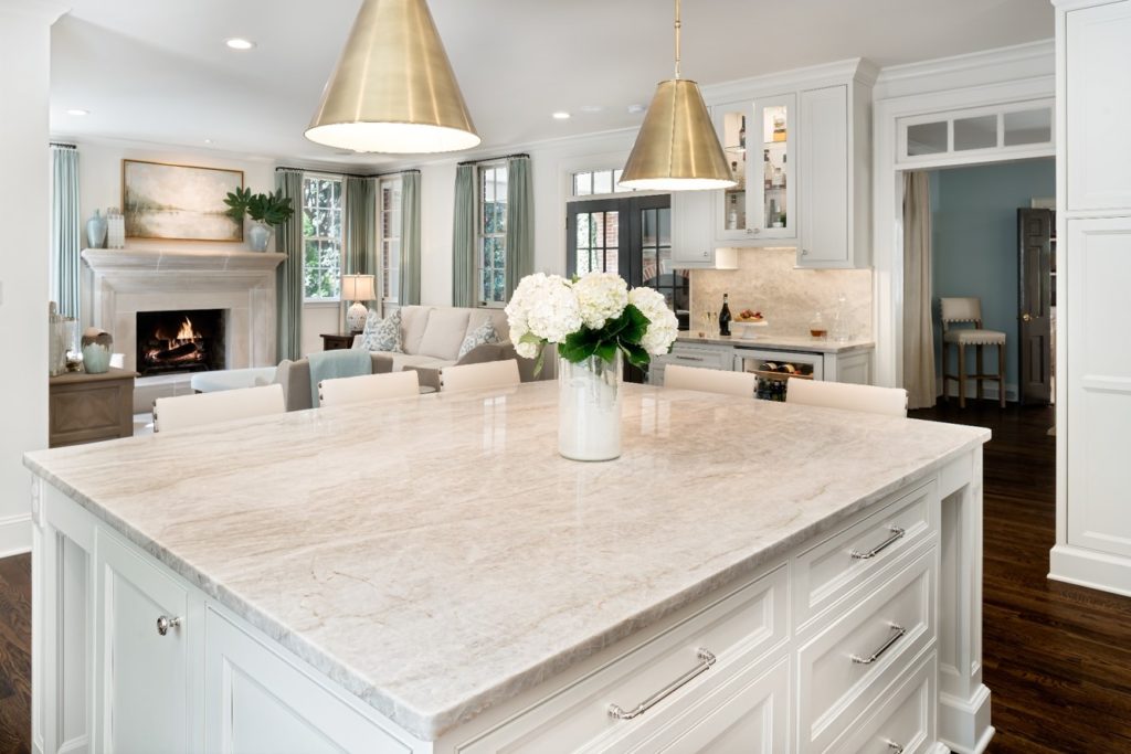
Simplifying the bar design made it visually recede and increased functionality. Removing the bar sink in favor of a dry bar allowed versatile counter space to act as an everyday drop zone or a serving space for entertaining. To delineate the bar from the kitchen while keeping some visual continuity, we repeated the same cream cabinets and used the quartzite slab material as a solid backsplash. Now guests (and kids) can easily mingle between the formal living room, the den, the bar, and the kitchen during gatherings.

The cased opening and original glass transom that were formerly separating the kitchen and foyer hallway were relocated approximately 6′ to incorporate some of the former halls into the new family-friendly kitchen design. As requested, a proper foyer was maintained in keeping with the formal architecture of the home.

An HVAC return and a tiny coat closet were relocated to create space for a custom pantry cabinet under the stairs. Increasing dry goods storage was an important goal for this growing family. Tall pantry cabinets with easily adjustable roll-out shelves are a great solution for maximizing the space available within a small footprint.

kitchen-design-ideas

BEFORE – The stepped design of the bar cabinetry made it feel heavy and intrusive and the sink and ice-maker were never used.

kitchen-design-ideas

AFTER –  A built-in beverage center provides space for wine, beer, and mixers outside of the main refrigerator.

kitchen-design-ideas

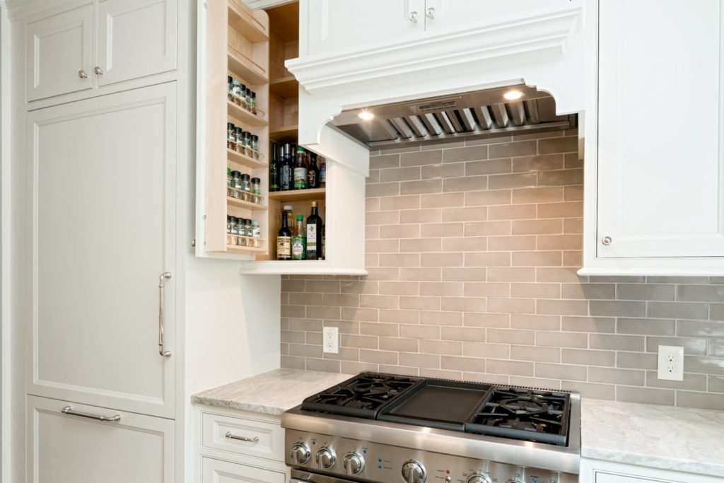
DETAILS – The built-in maple spice rack keeps herbs and spices organized and accessible. The fully integrated refrigerator with custom panel blends into the surrounding inset cabinetry for a traditional look.

Finishing Touches

A critical part of making the kitchen design feasible was incorporating two large steel beams —welded on-site—to support the second story floor above. Our engineering team created a structural design to ensure the integrity of the proposed kitchen design, resulting in the family-friendly entertaining space they desired.

In the den (now visible from the foyer) the colonial fireplace surround was replaced with a transitional cast stone design. Using the same material for the hearth, surround and mantel created a soothing contrast in textures as opposed to color, allowing the artwork to be the true focal point.

Custom cabinets, hidden storage accessories, matching appliance panels, and one-of-a-kind quartzite counters elevate this family-friendly kitchen design while maintaining a classic, transitional style.

kitchen-design-ideas

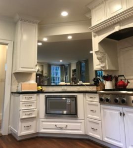
BEFORE – The hood overpowered the range top and the soffit and pass-through to the den dated space. Angled walls are an inefficient use of space.

kitchen-design-ideas

AFTER – Open site lines and clear traffic patterns are all part of this redesigned kitchen. Shades of cream, taupe, and sage green offer a soothing, timeless look.

kitchen-design-ideas

DETAILS – Wide island drawers with built-in drawer organizers keep knives and flatware neatly sorted, right where they’re needed most.

If your current kitchen design has you frustrated and disorganized, we’d be happy to talk through the possibilities with you. Schedule a call and our team will reach out shortly.

February 29, 2020 by Chelsea Allard

3 Ways to Create a Custom Kitchen Design

Whenever we begin working on a custom kitchen design with a new client, they almost always fall into one of three categories: A) Knowing what they want and relying on us to translate their vision; B) Strong opinions about a couple of crucial areas, but mostly open to any solutions we suggest for their new design; C) Unsure what they want, but the current situation isn’t working. Regardless of where you fall, here are three ways to create a custom kitchen design that feels personal to you and your family.

1. Utilize Custom Cabinet Modifications to Serve Your Needs

Higher quality, made-to-order cabinet lines are going to allow customization to some degree. This customization can be a game-changer for making the final kitchen design feel truly custom since it means we can make the cabinet as specific to your functional, aesthetic, or architectural needs as possible. Few kitchens don’t require at least one cabinet to be modified to maintain the best-finished look.

Backless wall cabinets over windows to allow natural light into kitchen

More often than not, we modify most cabinets to give our clients the best possible design. Modifications can include custom sizes, combining boxes to avoid seams in inset designs, adding unique storage accessories, or finishing the ends in a specific manner, just to name a few. The options are endless.

Bar height white kitchen island

2. Incorporate A Design Element with A Story

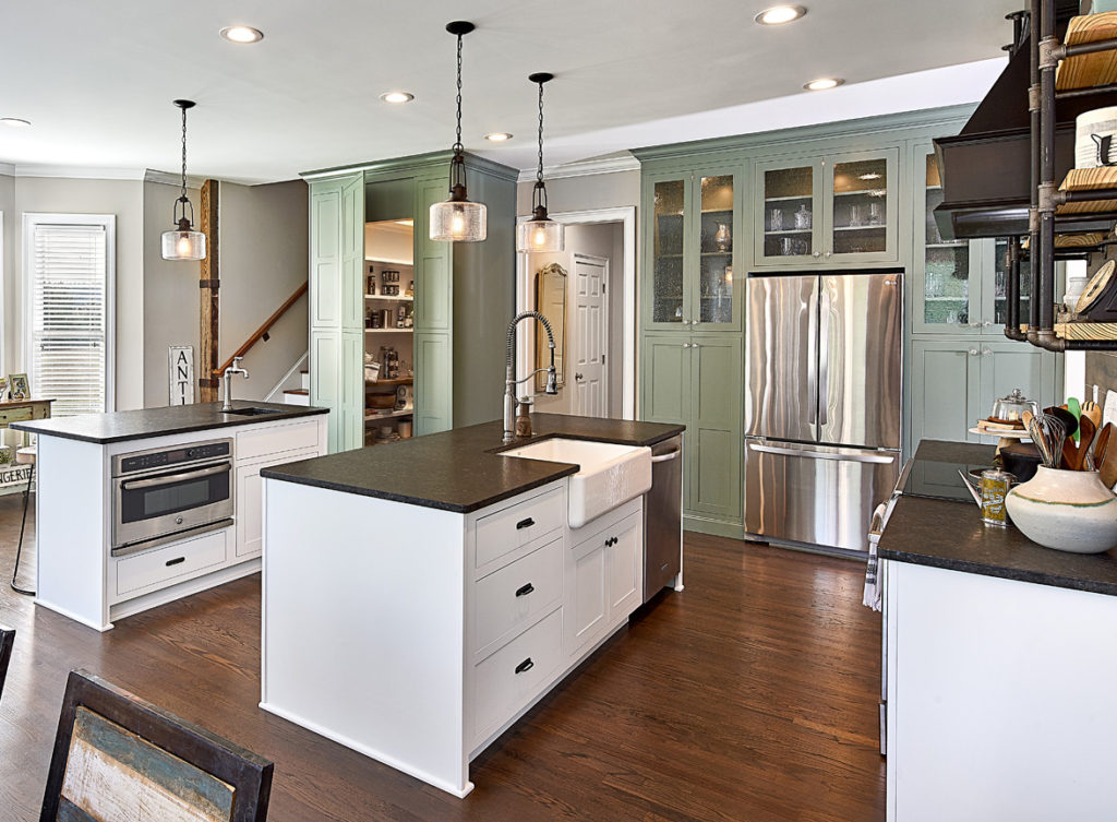
One of the easiest and most satisfying ways to set your kitchen apart from your friends’ kitchens (even if you have the same taste) is to incorporate something personal that tells part of your story. Our clients have approached us with unique pieces to include in their custom kitchen design on more than one occasion. Custom pieces include hundred-year-old barn beams found in an outbuilding on the property, a favorite light fixture that lasted through multiple moves, a custom colored range to match the label of a favorite bottle of champagne, and more. Incorporating these personal touches into our clients’ kitchen designs sets them apart from their neighbors.

Custom farmhouse kitchen design with reclaimed beam

We salvaged the vertical beam next to the staircase from an old barn on this couple’s property. Having a piece with a story gives extra life to this farmhouse kitchen.

You don’t already have something you’d like to include in the new design? No problem! Choose one item that has yet to be selected and pick something you love that can act as a statement piece. It can be something semi-permanent like a light fixture, unique cabinet hardware, or backsplash tile, or it could be something you find on your own like vintage stools for the island or a beautiful painting to hang in the breakfast area.

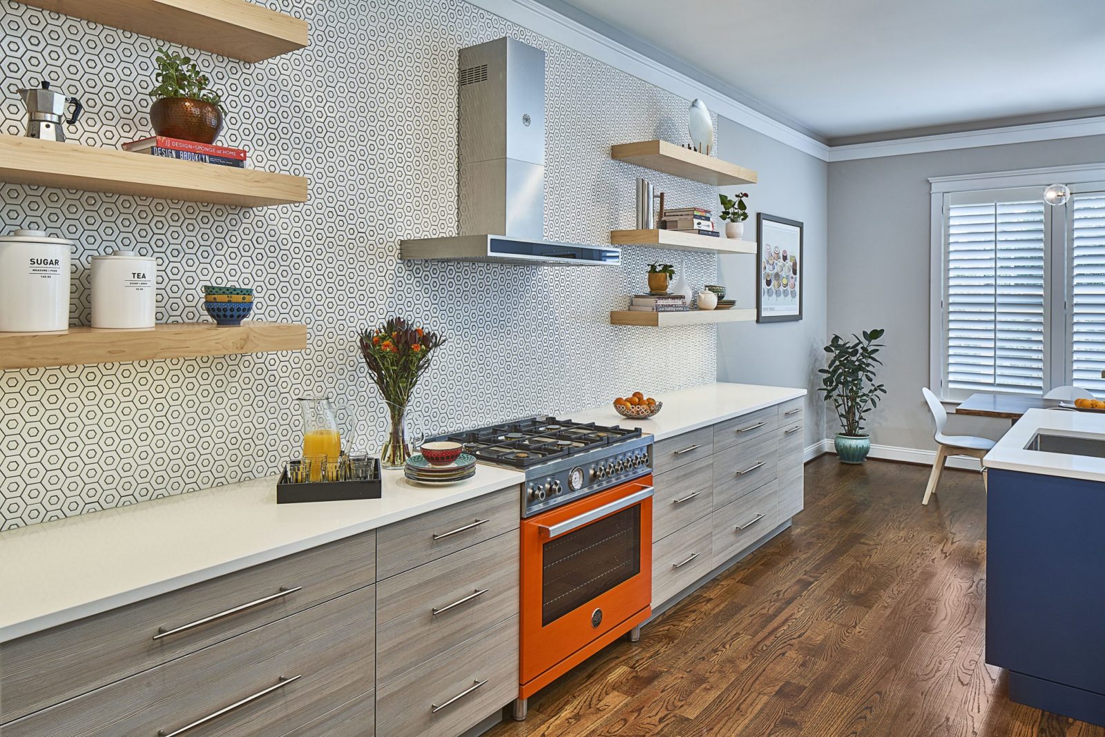
orange range in a modern kitchen with mosaic tile backsplash

3. Plan Storage to Support Your Daily Habits

Just because you make coffee and take supplements every morning as part of a healthy lifestyle doesn’t mean they have to be out on the counter in full view 24/7. Our kitchens are responsible for storing a LOT from everyday dishes to serving pieces, pantry items to charging stations. When everything has a place where it’s easily accessible and hidden from view, you’re able to move more efficiently and feel better in your space without visual clutter. Planning ahead of time, which tasks take place in which zones of your kitchen will help your kitchen designer suggest the best storage solutions to help your day run more smoothly from the get-go.

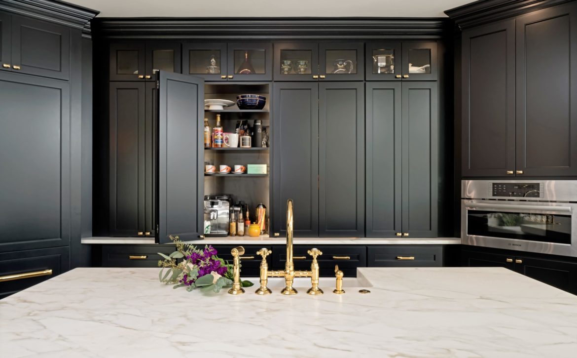
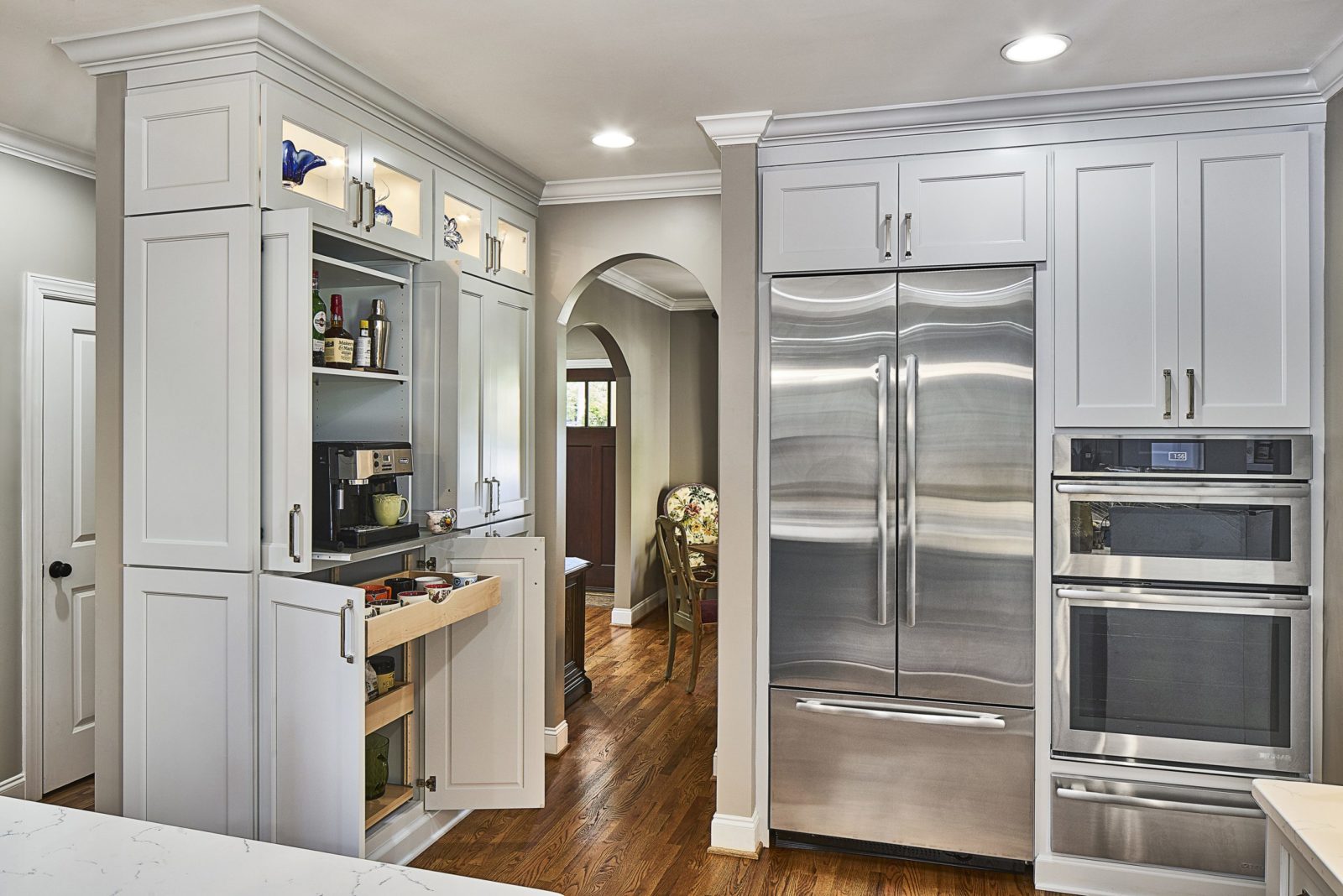
Built-in coffee station

One of the best ways to make a kitchen more functional is to store items by use instead of similarity. For example: Instead of keeping all glasses and mugs together in one cabinet, store drinking glasses near the refrigerator for access to filtered water and store mugs near the coffee station. Customizing the design for the way you move in and around your kitchen saves time as you won’t be crisscrossing as often while you’re preparing meals, snacks, and everything in between.

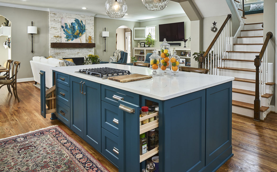
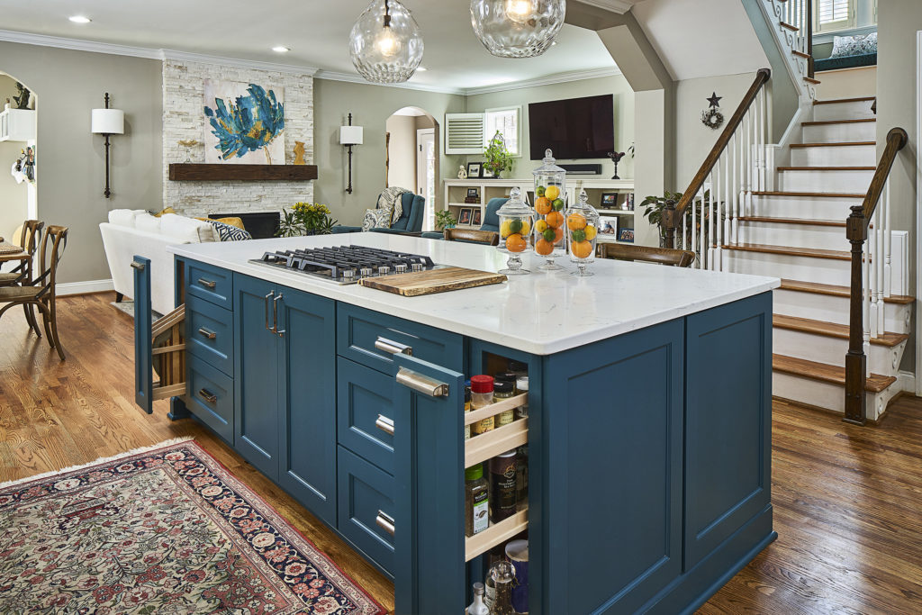
Custom-designed spice and tray pull outs in peacock green kitchen island

We placed narrow, pull-out storage cabinets for cutting boards and spices close to the cooktop for convenient access during prep.

Want to speak with someone about your custom kitchen design? Schedule a call to speak with one of our project developers.