Charlotte Architectural Styles and What They Mean for Your Home Remodel
Learn about Charlotte’s housing history which is rich with a diversity of architectural styles and themes that represent popular trends.
Learn about Charlotte’s housing history which is rich with a diversity of architectural styles and themes that represent popular trends.
Important design tips to consider including as part of your custom bathroom remodel.
The importance of a well-functioning master suite cannot be understated. After the kitchen, the main suite is the second most important space in your home. And just like the kitchen, the master suite is critical to a homeowner’s overall health and well-being.
To be at our best in a world that demands more from us than ever before, it’s imperative that we have a private, quiet space to rest, to nourish our bodies, and to begin and end our days in a way that promotes optimal health.
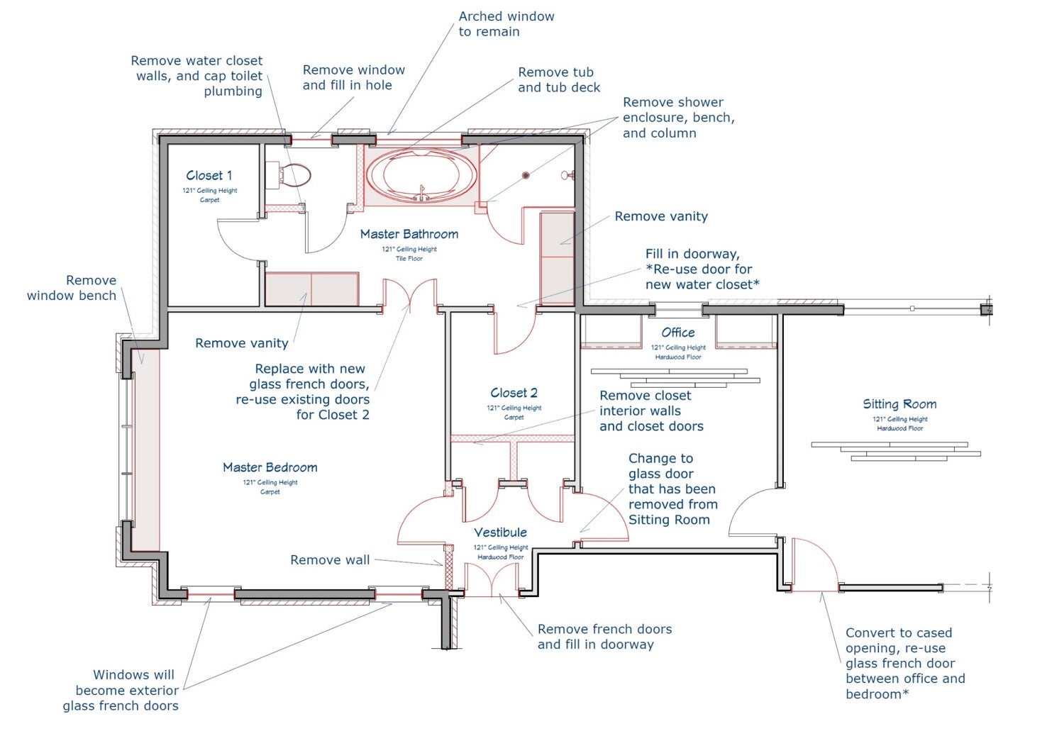
The demolition plan illustrates the inefficient and segmented closets and tight traffic patterns.
This couple wanted to create a unique master suite that not only reflected the style of the rest of the home but incorporated an international flare. While the design elements of a home’s more public spaces should flow to create a sense of continuity, private spaces like master bedrooms and bathrooms are a great opportunity to try something a little unexpected – like the graphic white and gold wallpaper they selected for the bathroom.
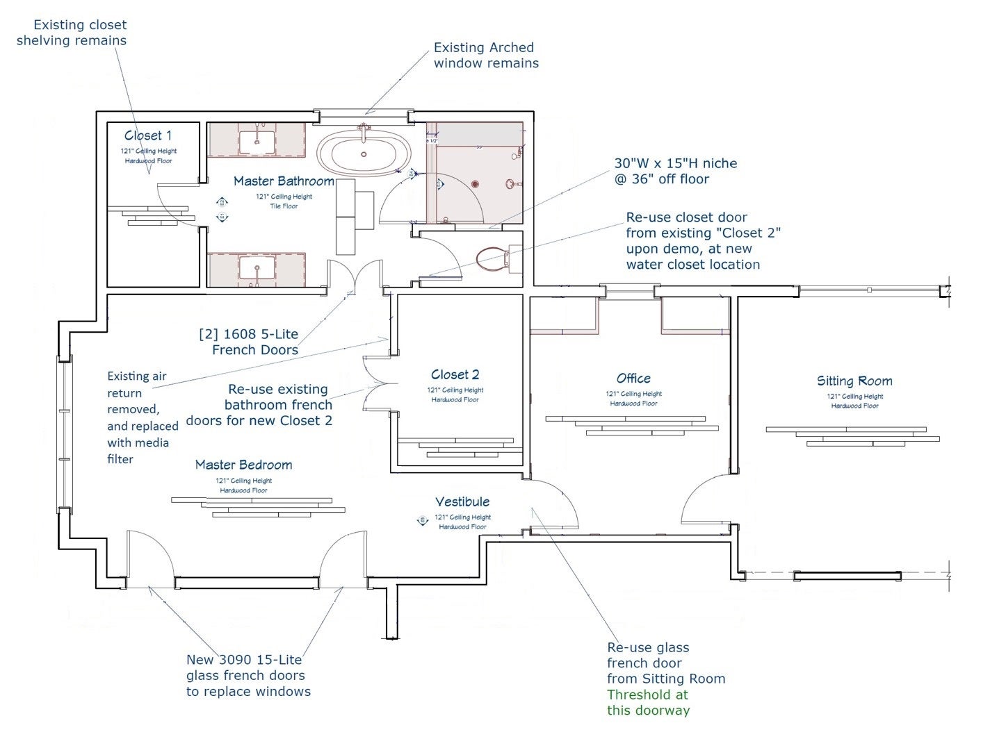
The bedroom remodel features the combination of multiple small closets, providing necessary (but separate) storage space, separate vanities, a larger shower, and a freestanding tub as the focal point while maintaining a private water closet.
By redesigning the two spaces we were able to maximize storage and natural light within the existing footprint, expand the shower, and simplify the traffic flow. Plantation shutters were replaced with motorized roman blackout shades for optimal sleep. Two windows in the bedroom were replaced with bedroom French doors to provide access to the outdoors and allow more light into the bedroom during the day.
The solid bi-hinged bathroom doors were exchanged with frosted glass French doors to maintain privacy while allowing light from the large bathroom window to spill into the rest of the bedroom.
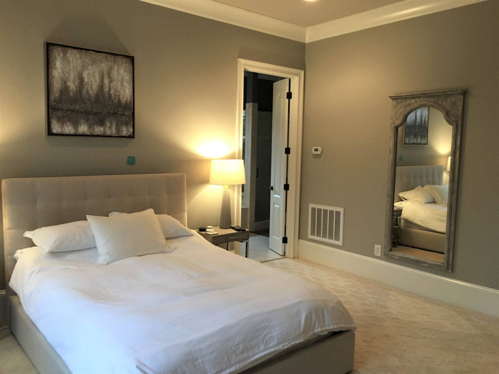
BEFORE – Solid French doors did not allow light to pass into the bedroom from the bathroom and the large HVAC return was unsightly. The dark walls made the bedroom feel heavy and dreary and the wall-to-wall carpeting felt dated.
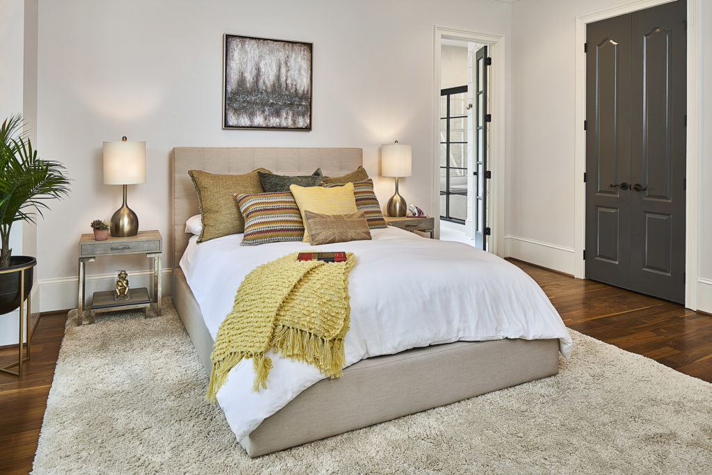
AFTER – New 5-lite frosted French doors separating the bedroom and bathroom repeat the 5-lite design of the custom, matte black framed shower doors. We reused the original solid french bathroom doors for the new closet entrance to save money and cut down on unnecessary waste.
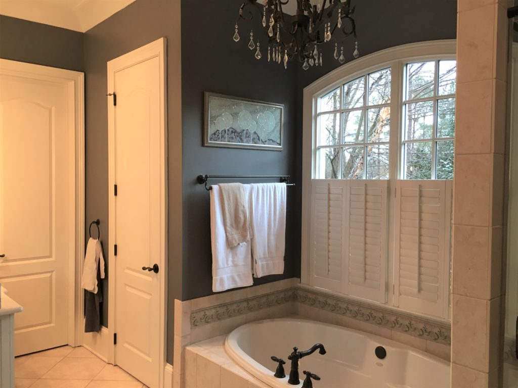
BEFORE – Heavy and dated fixtures made this bathroom underwhelming. The wall placement of the water closet and shower made the bathroom feel small and the unnecessary shutters and dark paint contributed to the cave-like atmosphere.
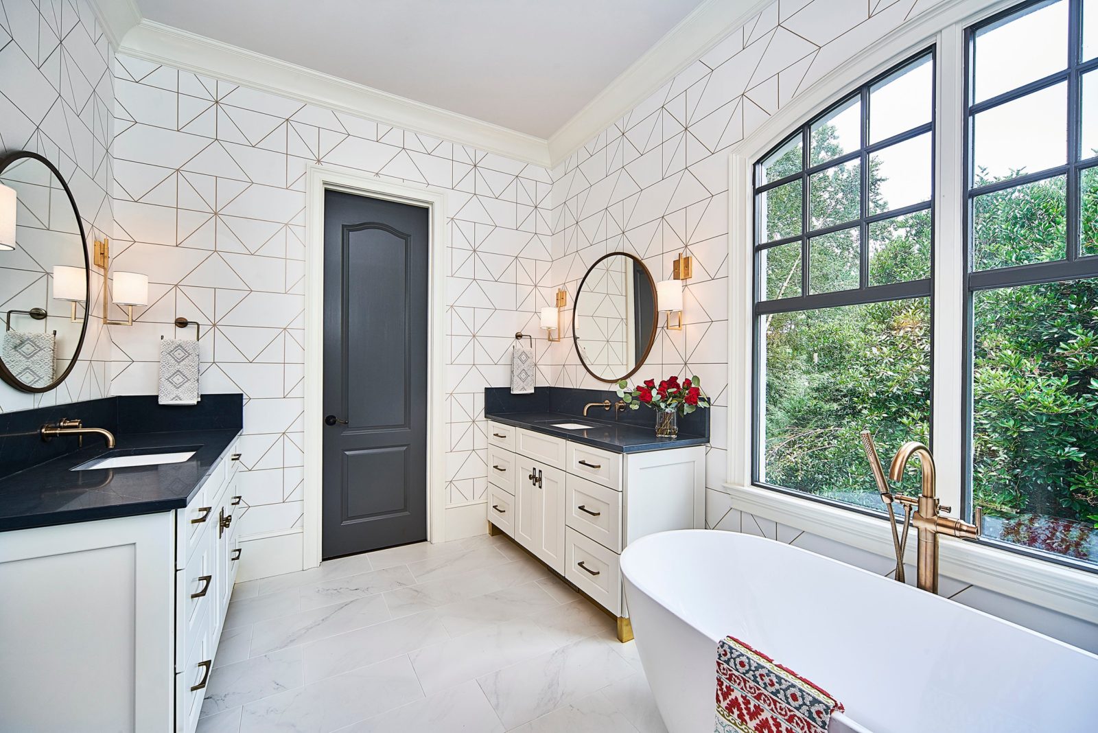
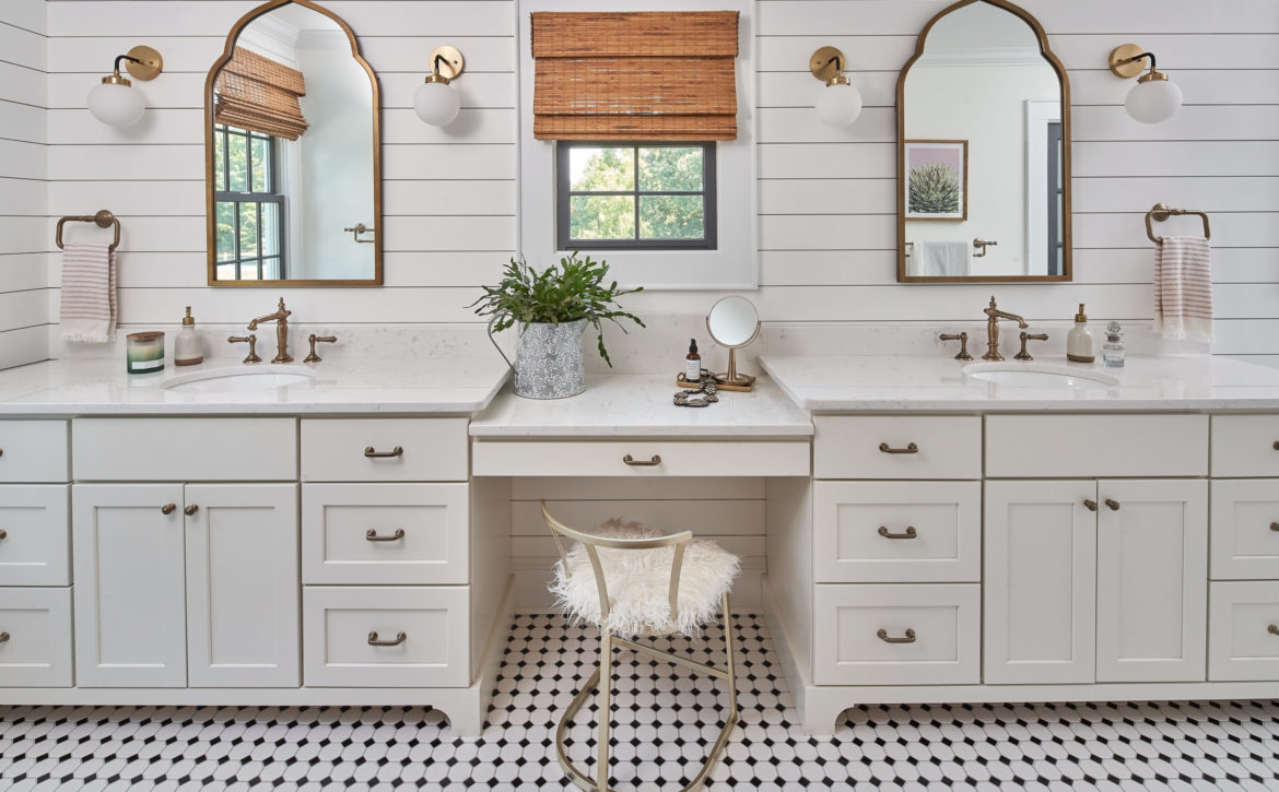
AFTER – The relocation of the water closet and removal of the shutters creates a spacious and bright experience. Soft textured, geometric wallpaper adds an unexpected and playful element to the white and black color palette. Wall-mounted faucets and oversized backsplashes offer a sleek solution to protect the wallpaper from water.
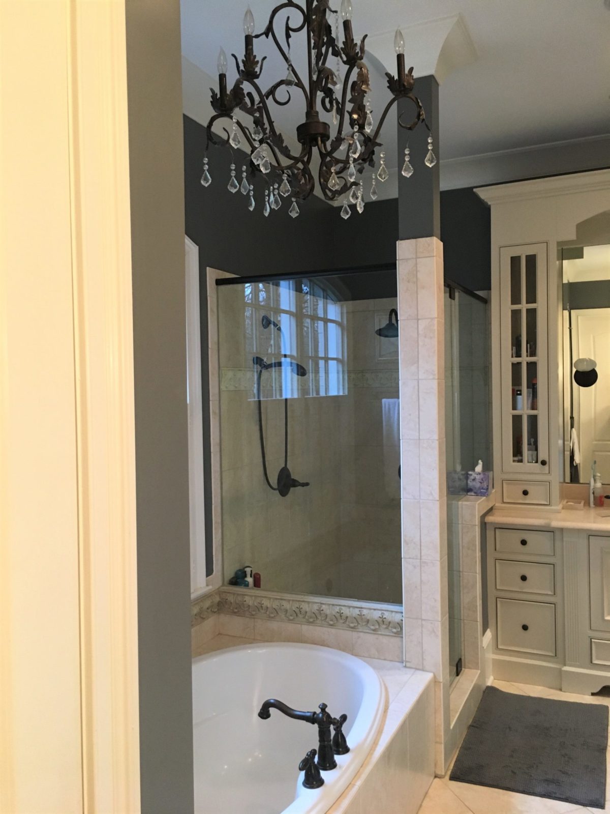
BEFORE – The existing floor plan contained a choppy layout, with many nooks and dark corners, including this sequestered shower. The heavily embellished vanities weren’t scaled for the room so they overwhelmed the space.
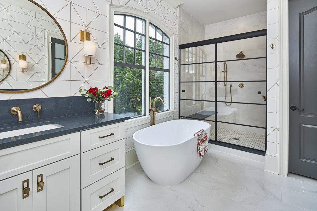
AFTER – By relocating the water closet beside the shower, our clients gained a larger shower, and a smoother traffic pattern where it’s less likely they’ll be in each other’s way. The shower features a custom sliding door system, fixed shower head, separate hand shower, and an oversized bench. The marble-inspired porcelain floor and shower tile lend a classic vibe without competing with the more modern geometric wallpaper.
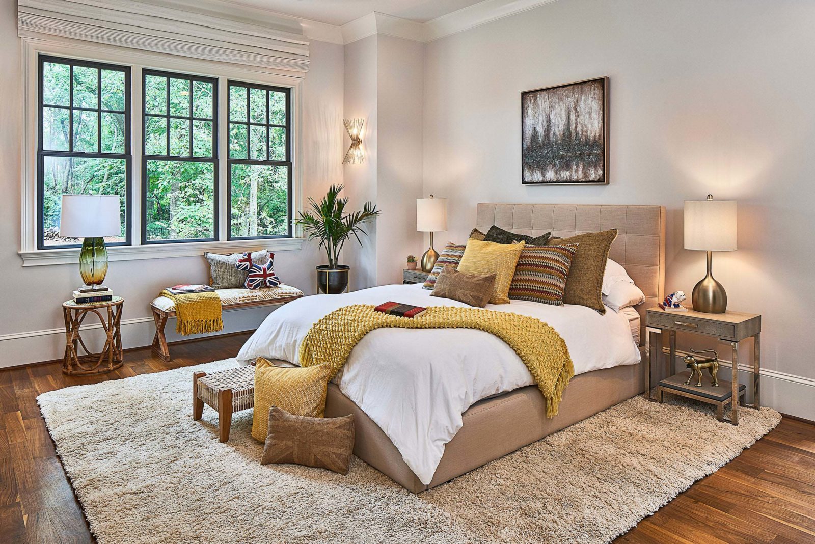
AFTER – The bright wall color makes this master bedroom feel more spacious, while the black painted window sashes add a pop of contrast. The new gold wall sconces are much more stylish than their previous pair and give off a soft romantic light.
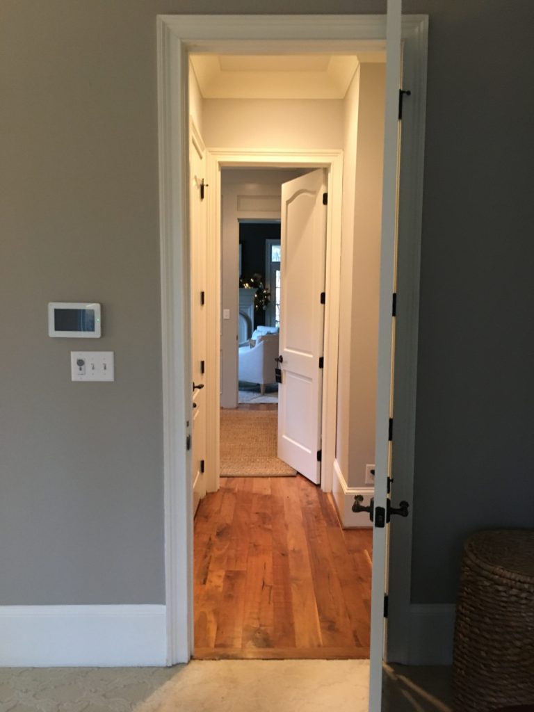
BEFORE – Multiple doorways separated the office from the bedroom, creating an awkward vestibule that was more of a pinch point than an asset. The light carpet in the bedroom made the two spaces feel even more disconnected and with two dogs, maintenance was a nightmare.
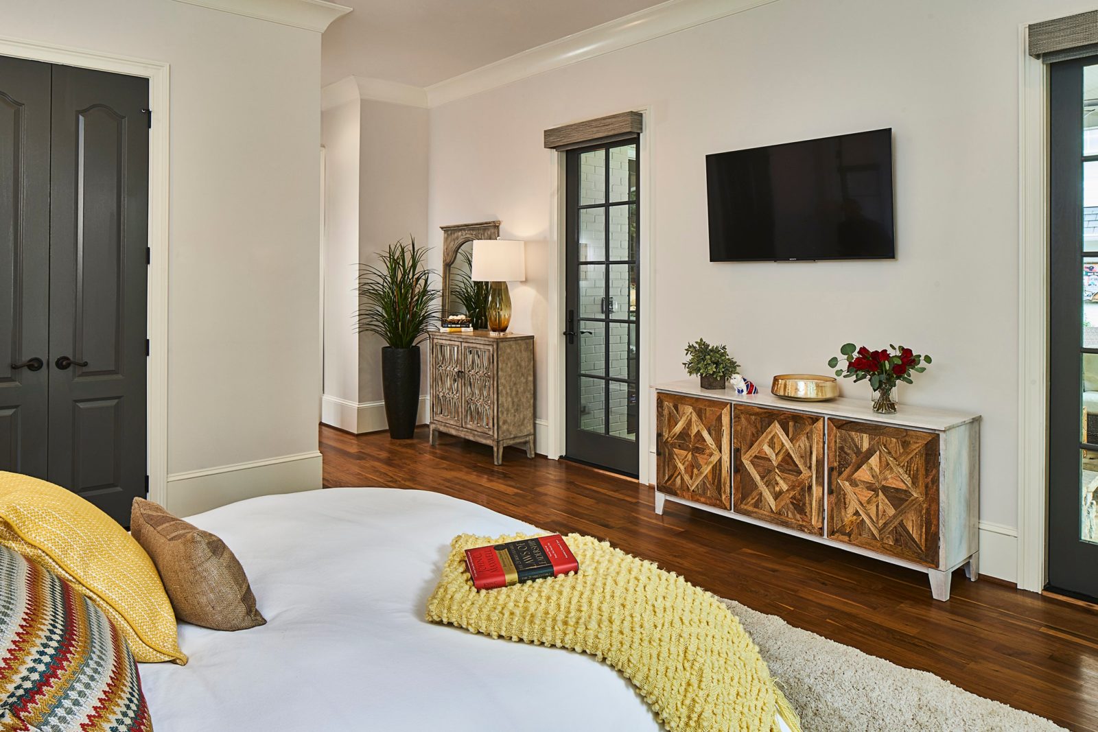
AFTER – A priority of this master bedroom makeover was creating better flow from the master bedroom to the office. The smaller closets were combined for more functional storage. Two new French doors provide direct access from the bedroom to the outdoor living room, while motorized roman blackout shades ensure darkness for optimal sleep. Continuing the walnut floors throughout the bedroom unifies the remodeled bedroom space with the office, and makes wiping muddy paw prints much easier.
By optimizing for storage and natural light, and incorporating a balanced design throughout the entire master suite, our clients now have a unique, award-winning space that offers a relaxing retreat to start and end each day.
When you’re ready to makeover your master bedroom, give us a call at 704-759-3920. Schedule a call with one of our project developers to discuss next steps.
Whenever we work with homeowners to redesign their kitchen or primary bathroom, it’s almost inevitable that at some point during the process they’ll ask, “what would you do?” While they are asking for our expertise based on what we know about their specific needs and desires, and not what we as designers would choose personally, we know that most of our clients are curious about our personal choices when it comes to our own homes.
Have you ever been curious about what a general contractor and a kitchen and bath designer would choose for their own house? Now’s your chance to find out! Last spring, we (Brad and Chelsea – yes we’re married!) bought a new house with the intent to pursue an immediate primary bathroom remodel, with plans to complete the rest of the downstairs, including the kitchen, in a second phase at a later date.
When you buy a house that wasn’t custom-built for you, there are bound to be functional adjustments that need to be made for the way you live. The original primary bedroom had brown carpeting and a door to the back porch that we knew we would never use, which threw off the symmetry of the back wall and limited furniture placement in the room.
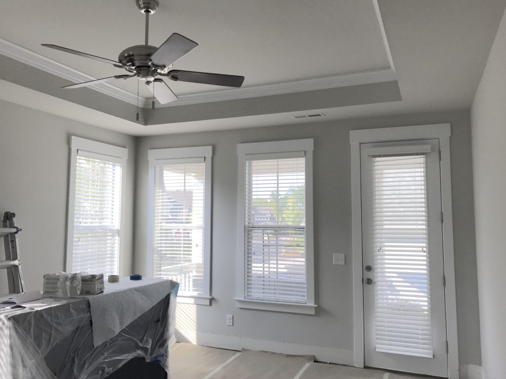
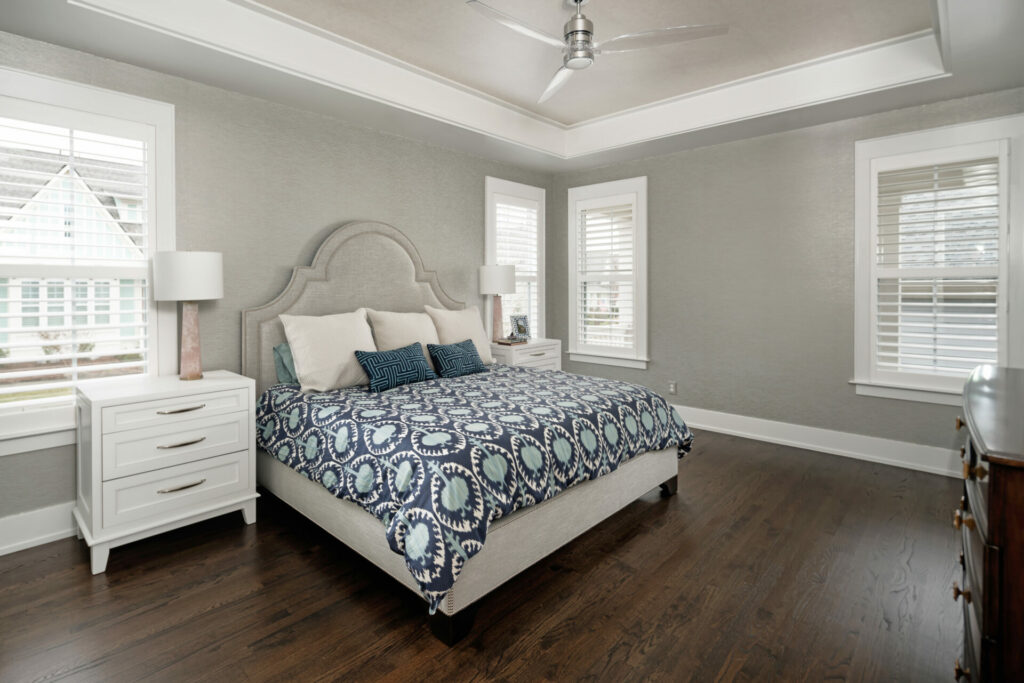
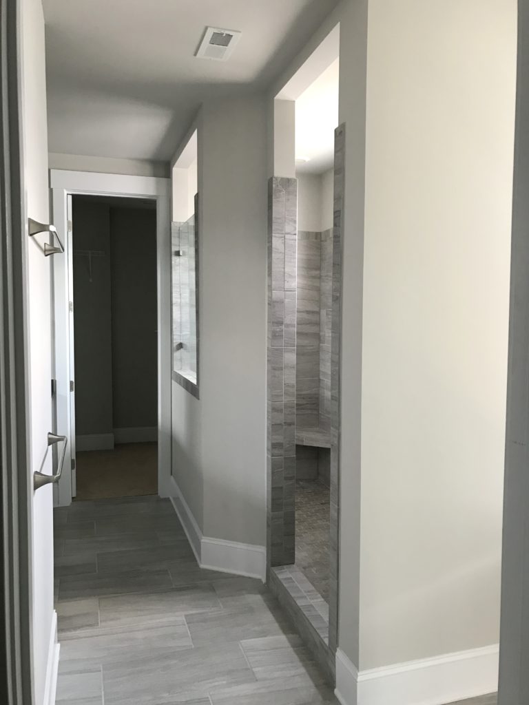
But the biggest problem behind the design of this primary bathroom? No bathtub. While many people never use a bathtub and much prefer a larger shower, we determined we wanted to have both. Since going upstairs to the tiny tub/shower combo in the kids’ bathroom was a deal-breaker, we decided that either the bathroom would get remodeled immediately to make space for our dream soaking tub, or we weren’t moving – it was that important.
Luckily, a 66” freestanding tub would fit and still allow ample space for a decent-sized shower, but it would require removing and replacing all three windows, patching the siding and completely repainting that side of the house, and securing HOA approval. No big deal!
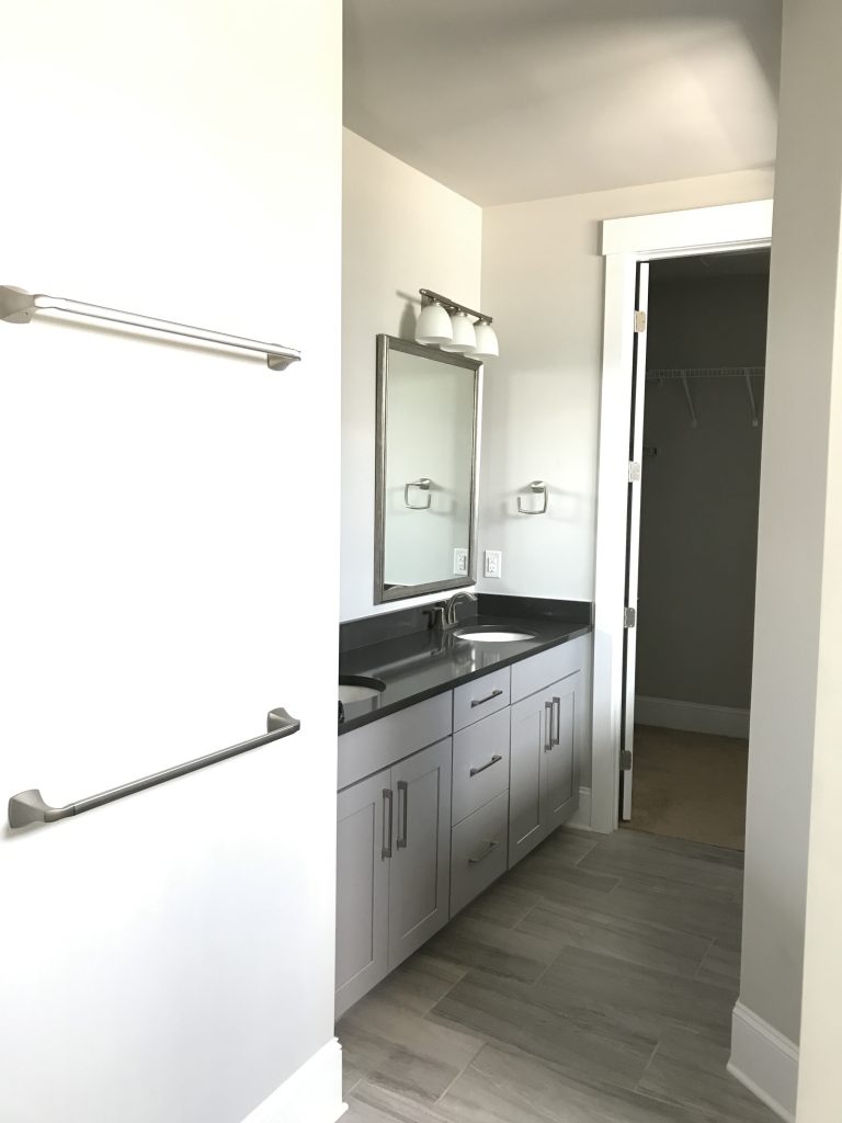
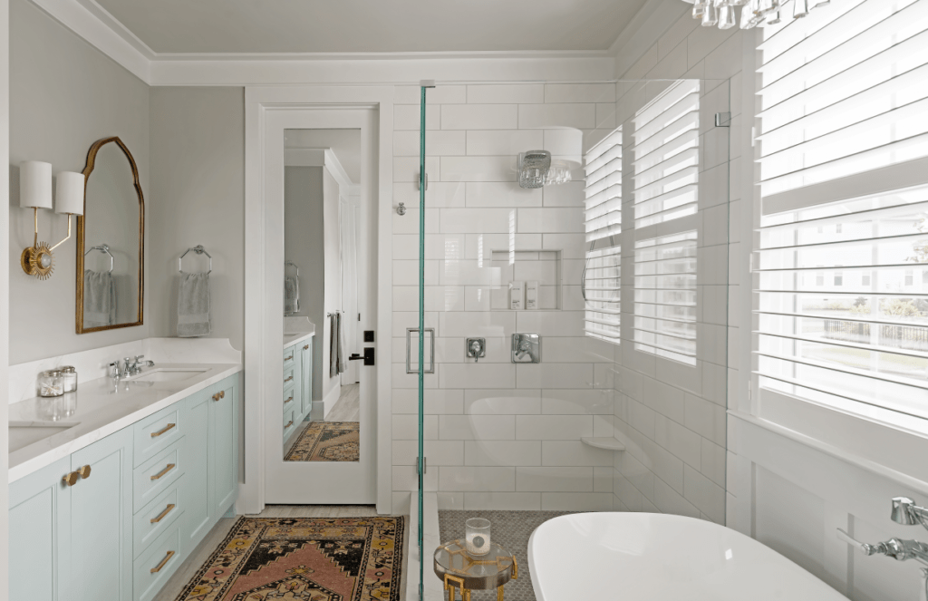
Due to the placement of the walk-in closet, laundry room, and stairs, the overall layout had to stay the same, but the shower was drastically reduced in size to make space for the freestanding tub. We set back the shower curb a few inches from the closet door casing to make more space in front of the vanity, with the frameless glass shower enclosure making the space feel more open and spacious.
New frameless cabinets in Annapolis Green by Benjamin Moore feature full height door sink cabinets with roll-out shelves inside for easy access. Frameless cabinet construction provides more storage space than framed cabinetry, which is always welcome in a small space. A shallow, matching wall cabinet was placed over the toilet in the water closet to house extra supplies.
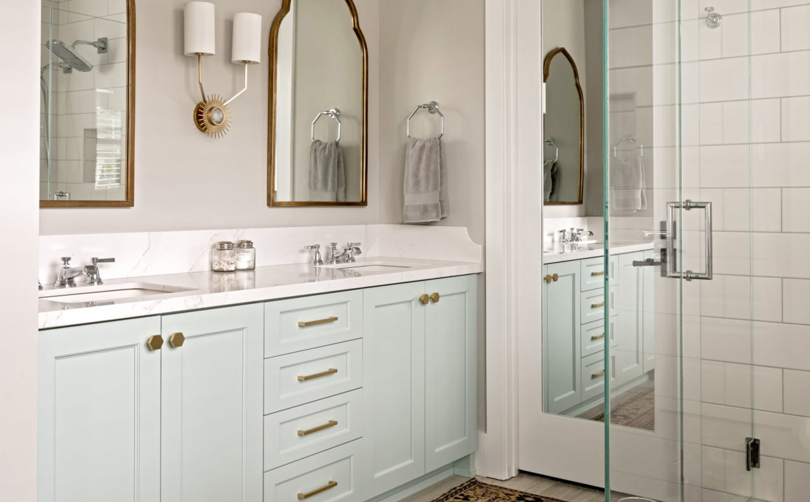
Our inspiration started with the turquoise vanity and brushed brass hardware pulls — the rest of this primary bathroom remodel took off from there. The counters, shower curb, and foot prop are made of Silestone quartz that has all the beauty of Calacatta marble but none of the maintenance. The subtle gold veins coordinate with the brass metal tones throughout; since the turquoise vanity anchors the room, we made sure the remaining materials and finishes were neutral.
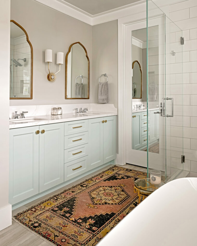
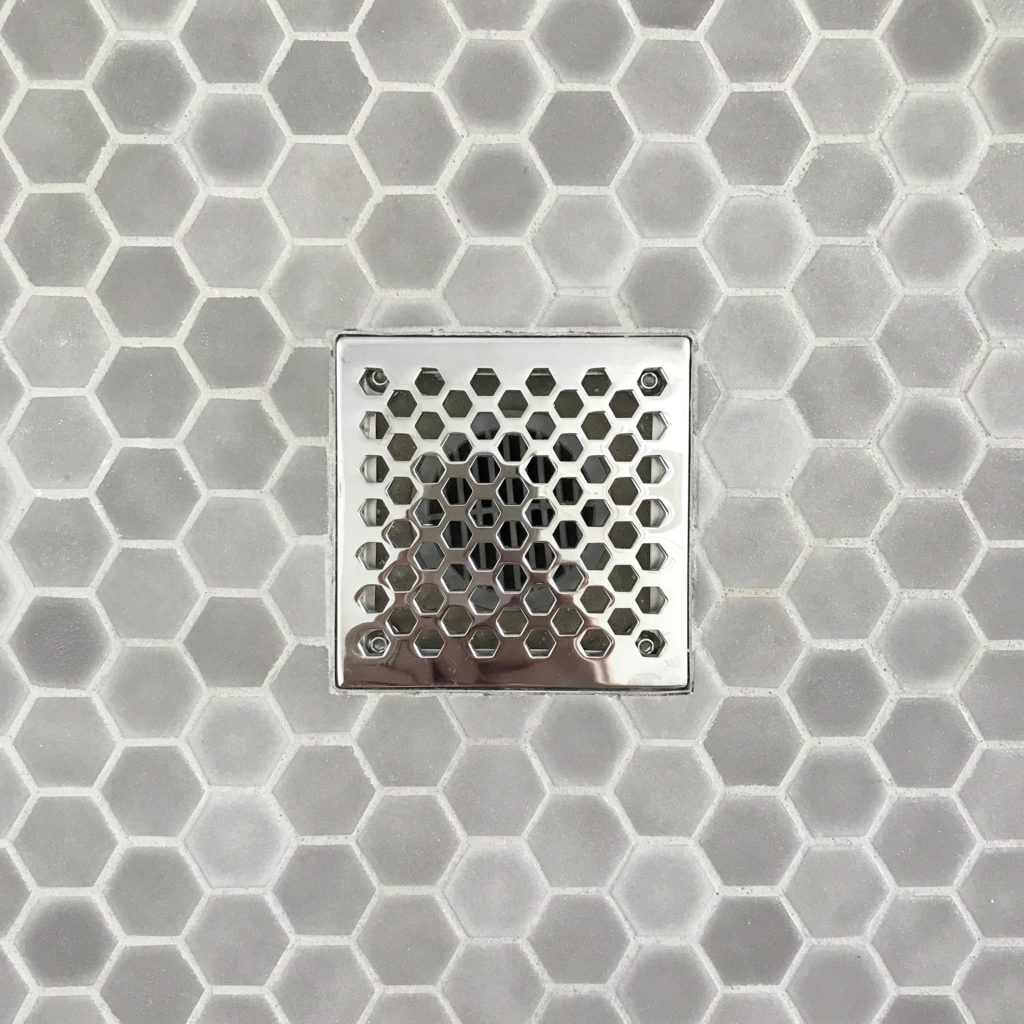
We chose a 12 x 24” porcelain from Dal-tile that looks exactly like a vein-cut limestone. Not all limestones are suitable for wet locations, and we didn’t want to deal with the maintenance of natural stone. Instead, we used a large format 6 x 18” ceramic tile with a white eggshell finish in the shower. The larger size meant fewer grout joints and the eggshell finish does a remarkable job of hiding water spots between cleanings. A 1” hexagon mosaic tile with a slight non-slip texture makes the perfect surface for the shower floor. The finish it off, we installed shower drain cover from Newport Brass with a hexagonal motif that coordinates perfectly with the surrounding tile. Nothing needs to be generic, even shower drains!
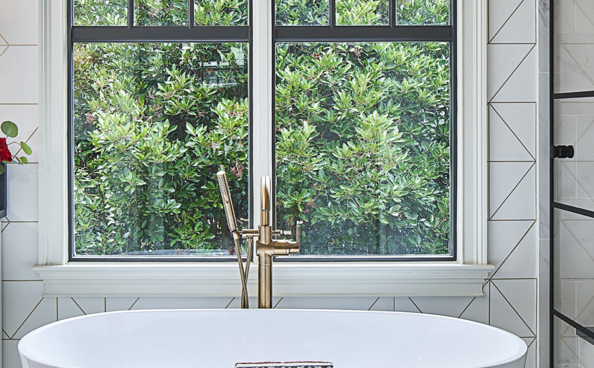
The plumbing was one of the easiest parts of this remodel – when it’s your own bathroom, you’re able to use your favorite things! In this case, we included the Victoria and Albert Amiata tub, for its clean and graceful profile. The propriety material is heavy, so it feels substantial when you’re inside it and it doesn’t bounce like thinner acrylic models sometimes do.
We chose the Kohler Pinstripe faucet suite for its classic, slightly masculine lines — and if we’re being completely honest the octagon-shaped hand towel rings. Even though chrome is a classic finish that goes with everything, we would have preferred polished nickel fixtures. Unfortunately, the Hansgrohe shower heads (a non-negotiable for Brad due to their raindance technology) were only available in chrome, so chrome it was. An advantage to using a chrome-like finish is that you can mix and match manufacturers to get exactly what you’re looking for. Not all plumbing suites have every configuration, so knowing which ones we could mix and match easily was key to using parts from several manufacturers.
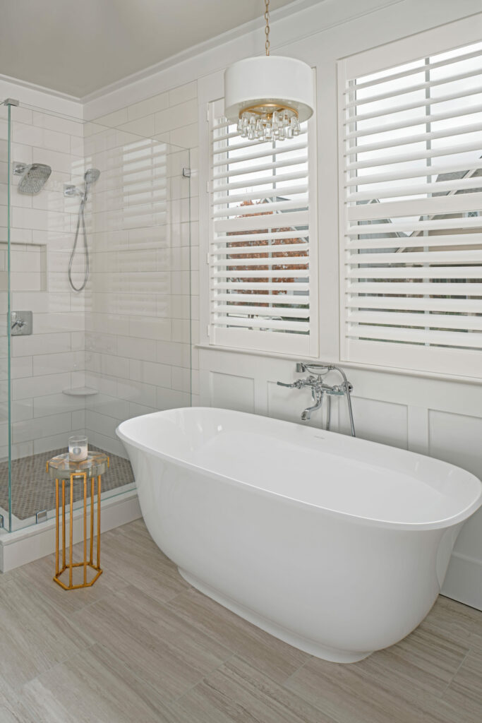
Since the Pinstripe line didn’t have a wall-mounted tub filler, I found one of comparable quality by Brizo that coordinated well. It has a similar escutcheon to the Pinstripe faucet, and lever handles. Since they’re not right next to each other, you’d never notice they weren’t the same faucet suite.
We’d love to say that because we were the “clients”, everything went off without a hitch, but construction doesn’t discriminate — there will always be stress and there will always be delays, no matter how well you plan. Even we had to deal with a missing part and some damaged materials. One side of the house was without siding, exposed to the elements the day before the rains from Hurricane Florence hit! Luckily our team got the siding up just in time so we didn’t have to worry. Our house was a dusty construction zone, and not wanting to have our new custom upholstered bed delivered before or during construction, we slept on a mattress upstairs on the floor for four months while we planned and executed the project. It was not glamorous. Remodeling is uncomfortable, but a few weeks or months of discomfort is worth years of enjoyment later.
